If you’ve visited the National Museum of Scotland in the last year, you probably saw a QR code in one of our exhibitions. There’s a good chance you even used one! Did you get your phone out and scan it? Or walk on by? Adam Coulson looks into changes in visitor behaviour in UK museums, and offers a set of design tips for museums to make best use of QR codes.
The use of QR codes in museums is a polarizing topic. These little black and white squares seem to generate strong feelings in the museums community. Take this tweet for example. Some comments are full of praise while others see them as exhausting or irritating.
Here at National Museums Scotland we’ve been trialling different ways to use QR codes in our interpretation and visitor information. Earlier this year I presented some initial findings to our Exhibitions & Design team to share data around what happens once these little squares are released into the wild. We wanted to understand how visitors engage with them, and how we can design the experience in the most integrated way.
This blog is part of a series where we aim to work in the open, sharing what we discover with the wider museums sector.
What is a QR code?
Quick response (QR) codes certainly aren’t new. They’ve been around for more than 25 years and were invented in 1994 by a Japanese car manufacturer. Put simply, they’re a way to direct people to digital content or services.
In Asia they’d seen a large take-up due to their use as a payment mechanism with popular services like WeChat and AliPay. By contrast, take up in the UK was generally very low until very recently. In fact, they were viewed as a bit of a joke in UK and US museums with many lacking a meaningful use case for them, and museums also harbouring a dislike for cluttering up carefully considered interpretation and messaging panels.
A wave of QR codes began appearing in UK and US museums and galleries throughout the later 2000s, with early adopters including Pennsylvania’s The Mattress Factory (2009) and Brooklyn Museum (2012). Adoption was low through the following decade, with Cuseum lamenting their terminal decline in The Life and Death of QR codes in Museums (2016).
Research claimed that back then, as many as 97% of people didn’t know what QR codes were. Low take up by visitors was largely due to the majority of smartphones not being able to scan codes ‘out of the box’, instead requiring you to download a separate app. Some visitors at the time also referenced security concerns and impacts on smartphone battery life as other reasons to avoid them.
So what changed?
Since 2017, QR code readers have been included in all new Android and Apple software updates. This lowered one major barrier and meant smartphone users were now (technically) able to scan codes using their smartphone camera without the need for a separate app.
By 2020 91% of active iOS users had access to in-built QR code scanners, eliminating the need for a separate app, and it’s estimated that by 2022 QR codes will be accessible to one billion smartphones globally.
Coupled with the technical ability to scan codes, the COVID pandemic forced a renaissance in the UK as QR codes suddenly became an essential tool to safely access services and content without physical contact. We all had to learn how to use them on a daily basis to access mandatory health services like COVID tests and COVID passes, and once the hospitality sector began to open up, food and drink too. As one colleague put it: “You’ll learn fast if that’s how you get your gin & tonic”.
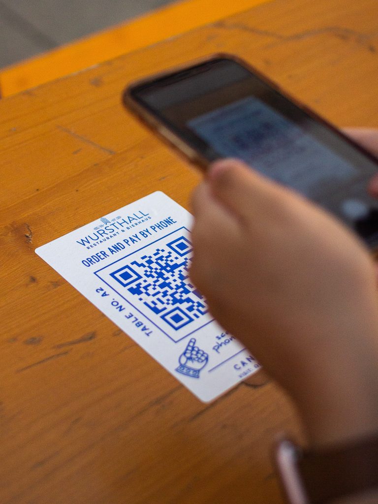
Visitor attractions and GLAM orgs have been using them for years, but there’s little data available on which to base design choices, so the examples of QR codes use at National Museums Scotland below are intended to fill that gap, and help inform our thinking about future design.
The Galloway Hoard exhibition
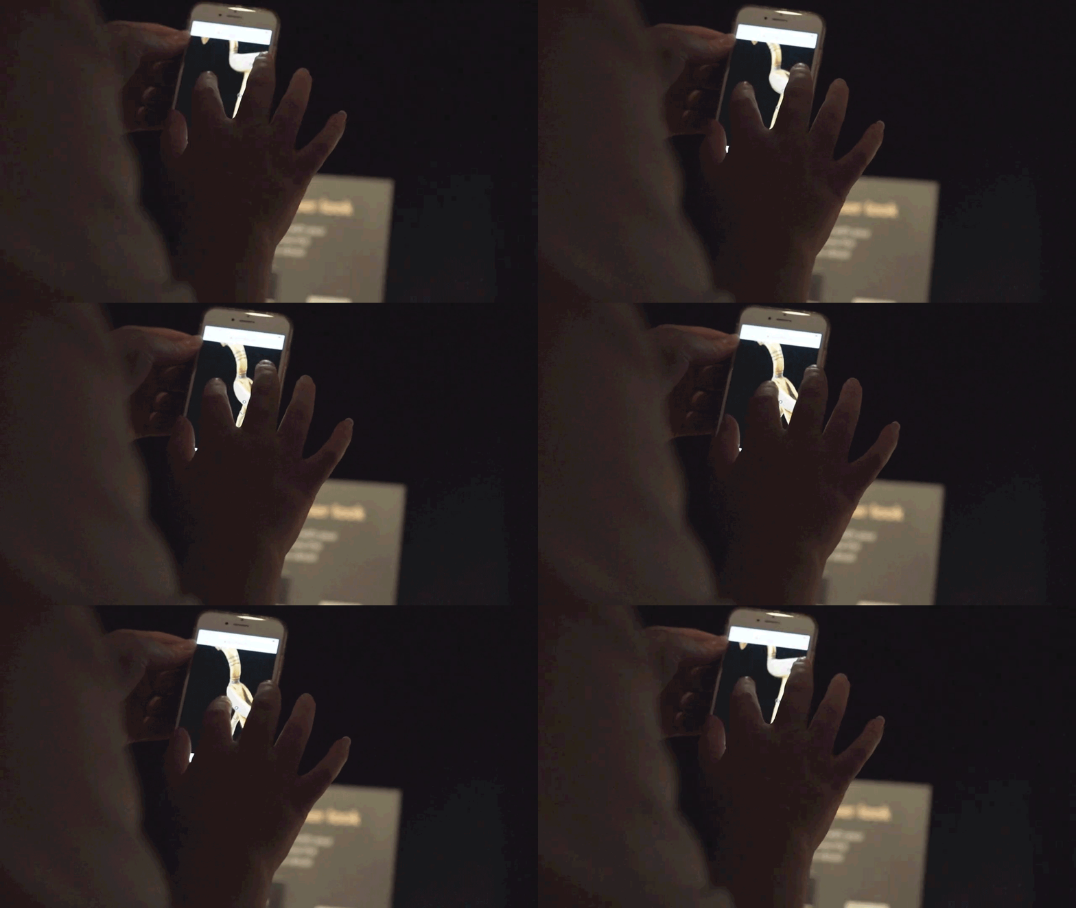
This high-profile exhibition brought together the richest collection of rare and unique Viking-age objects ever found in Britain or Ireland. Taking place through the summer of 2021, it ran in the largest exhibition space in the National Museum of Scotland.
The conservation work around the items in the hoard involved photography and the creation of 3D models. Given the ongoing COVID restrictions at the time, we chose to place QR codes beside the cases of key objects as a way for visitors to access the models. This meant they could manipulate and get closer to the digital versions which was obviously impossible with the physical objects themselves.
The QR codes and call to action were placed on moveable stands, rather than on the cases themselves. We decided with our Exhibitions team that this was the best approach due to timing, reliability, and the opportunity for these stands to also go on tour with the exhibition. Being able to move the stands also meant they could be placed to the side of the case to avoid potential crowding around popular points in the journey, and we could respond to the visitor flows on busier days.
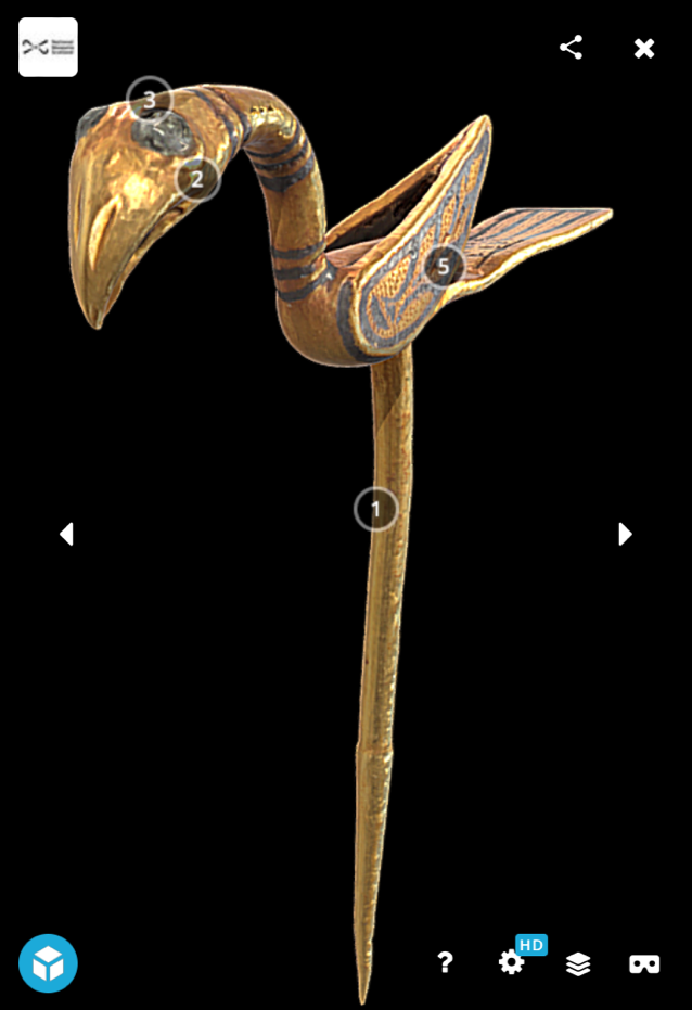
We had positive anecdotal feedback from visitors who enjoyed being able to look closer at details and textures of carefully worked metal (like this bird pin). The 3D models were hosted and viewed in full-screen mode on Sketchfab, which offered a more seamless experience than linking visitors to a page on our website.
The Galloway Hoard offered us a way to test this interaction. As a free exhibition within the wider free-to-access museum, we were able to measure how many people visited this gallery and compare with the engagement of the QR codes.
65k people visited the exhibition and the QR codes were scanned 26k times. Using the analytics data within qr-code-generator.com we were able to see which of the 3D scans/objects was most popular, which also gave us insight into the visitor flow.
The Typewriter Revolution
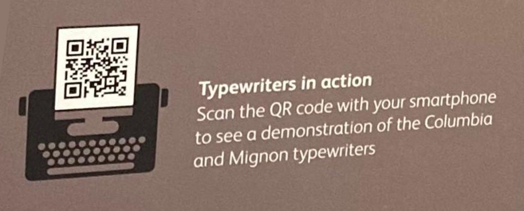
For this exhibition we created short videos of six typewriters in action. The aim was to offer visitors a closer look into the motion and hear the sound of these fascinating machines. We wanted to add some of that unmistakable click-clacking sound of keys being pressed and letters being hammered.
Our designer created a QR code in the style of typewriter which helped integrate the code itself into the content and feel like part of the experience.
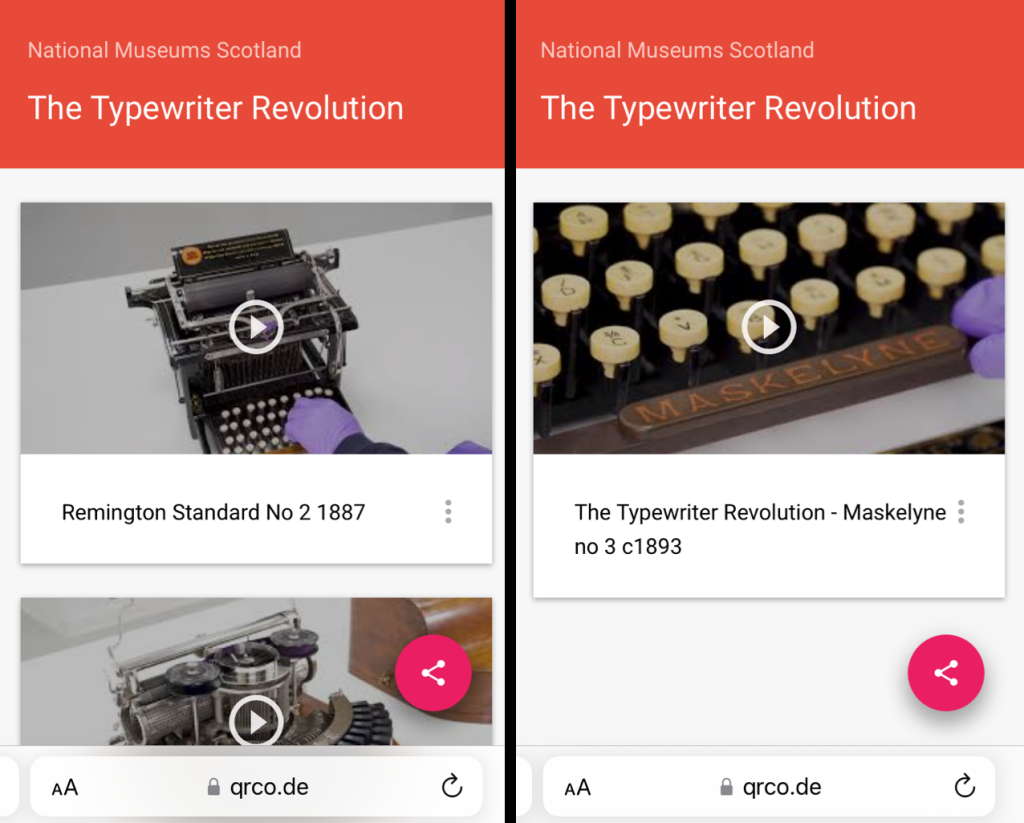
We placed four QR codes on case labels, and linked to video content on bespoke landing pages using the exhibition colour palette, again to ensure a seamless look and feel.
The Typewriter Revolution opened in July 2021 and had 132k visits through to June 2022. In that time the QR codes were scanned 6k times.
Inspiring Walter Scott
We chose to integrate QR codes into this smaller exhibition at the National Museum of Scotland to add audio into a gallery which is usually difficult to achieve. This particular space is positioned adjacent to the large Grand Gallery (the most popular – and noisy – space in the entire museum).
This exhibition explores what inspired Walter Scott’s stories, so we were keen to add some audio so visitors could listen along as part of the experience. We recorded five readings which were accessible via QR codes placed on each case label. The content was accessible within the exhibition, but also available on our website.

Due to the size of this exhibition, the budget only stretched to producing audio so we published the content on our website rather than creating a separate, bespoke resource. This meant it was a better experience when accessed via desktop which wasn’t ideal, as visitors in the gallery had to scroll down the page past the header image to play each reading.
As a small area off the Grand Gallery it’s difficult to monitor visitor numbers (it’s a free-flowing space) so the QR code data has been useful as a way to monitor visitor numbers, as well as understand take-up of the audio content.
Since opening in August 2021 (11 months at time of writing) the codes have been scanned 1,060 times.
Worth the effort?
When used considerately, with user behaviour and context taken into account, QR codes can be worth the effort. In response to the article ‘Reasons not to bother’, which argues that QR codes will ‘go the way of Betamax tapes, Zip drives and other short-lived, overhyped technologies’, here are my responses to some ‘reasons not to bother’:
“No one understands them“
Since Covid, this is not the case. I’d argue that the numbers for the Galloway Hoard exhibition in particular (65k visitors, 26k QR code scans) show that visitors do understand them.
“One bad QR Code impacts all others“
This is about trust. Thankfully ours is a trusted brand (as museums tend to be), so visitors are more likely to feel comfortable scanning a QR code in a museum than in a less trustworthy location. There are ways to influence this trust, such as hosting QR code content on your own domain rather than third-party sites.
“They’re not worth the effort“
In my experience, we only use them if they are worth the effort. We deliberately choose them where they add something, and try to avoid using them where another method will do. We’ve shown that adding layered interpretation in an exhibition means that visitors can engage with stories in a number of ways, and QR codes afford us the opportunity to provide extra for those who want it. It’s not for everybody, but that’s okay.
QR code design tips
Based on our trials to date, I’ve compiled a list of things to consider when designing a QR code experience:
Designing the experience
Don’t assume everyone will scan, as many won’t (for lots of reasons).
Make contextual choices. Does the QR code offer a gateway to something worthwhile for the visitor? Does it provide additional context, knowledge, or viewpoint, or just more of the same?
Consider Image rights / IPR. We’ve avoided use of QR codes when loan items have restricted image rights, meaning we’d prefer visitors not to use their smartphone in the exhibition.
Consider visitor flow. Could a carefully-placed QR code help create more space for visitors or help avoid over-crowding?
Think about the digital user journey. Can we ensure exhibition design choices like colour palette follow through in the mobile experience?
Avoid overkill. Less is more.
Discourage FOMO. Avoid adding lots of information behind a code, otherwise visitors may leave feeling that they didn’t see everything.
Security & confidence
Add a call to action. Be clear about what will happen when you scan. Include a call to action with the code to set an expectation (ie, “Scan the QR code with your smartphone to see the 3D object”).
Link to your own domain. Linking to your own domain (in our case nms.ac.uk) helps give visitors confidence that there’s no scam/spam links (critics legitimately cite security concerns due to the visitor not know where they’re linking to).
Research highlighted battery life as a main barrier for many users so try to keep the Wifi/4G burden lightweight where possible.
Placement
Consider sizing. A key factor here is the distance from the smartphone, so a rule of thumb is to print the code at one tenth the size of the distance. If the visitor is likely to be 1m from the code, it should be printed at 100mm x 100mm (though QR codes can be printed at 20mm x 20mm and still work).
Make it integrated. Design and position the code in a way which feels like an integrated part of the experience, not just a sticker added later.
Short URLs. Include a short URL beneath the code to give people another chance to access the content.
Get your angles right. Don’t place them in awkward places relative to where the visitor will be viewing from, ie inside cases or angled away from the viewing direction.
The test and learn approach was summed up well by one former museum person: “If it’s sh*t? Take ‘em down again. Think a bit, do it, evaluate it, change it. Repeat.”
Do you have any tips or best practice? Share them in the comments below.
Further reading
- How can QR Codes benefit museums? (Museum Next, 2022)
- QR Codes: A blessing or a curse? (LA Times, 2022)
- To QR or NFC, that is the question (University of Cambridge Museums and Botanic Garden, 2022)
- Digital accessibility: QR codes and short number SMS (VocalEyes, 2021)
