Through 2019 and 2020 we’re embarking on a journey to re-develop key areas of our website (nms.ac.uk).
The site in it’s current form is now a few years old, so our overarching aim is to iron-out some known issues and create a more user-friendly website in the process. We want to direct visitors to the information and content they are looking for in the simplest and most appealing way.
First stop on our road map is a revamp of the site-wide navigation and a refresh of how we present our exhibitions and events programme.
Why change?
We carried out some user testing sessions with a group of specially selected testers.
The sessions revealed three broad issues which formed the basis for our design challenge:
- The navigation was busy and confusing for visitors;
- Key visitor information wasn’t obvious enough;
- Information on exhibitions and events was often hard to find.
Simplify: The navigation was busy and confusing
The new navigation is deliberately pared back and simple.
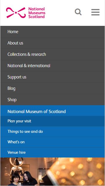
Our aim was to move away from the busy header navigation which included up to three levels of menu items. On mobile, these three levels take over the entire screen (see below), so designing a solution which worked for mobile was a key focus (with 48% of all traffic accessing nms.ac.uk being via mobile devices, 42% via desktop and 10% via tablet).

What seemed neatly aligned to a desktop page header ended up pushing core content down the page on mobile and making for a very busy structure which our test group told us wasn’t working.
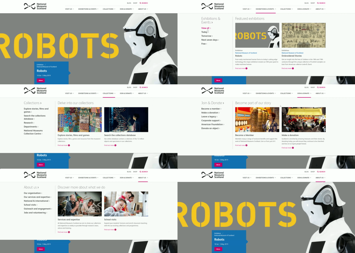
The new expandable drop down sections are designed to tell the story of the organisation in a logical order of how visitors tend to engage with us, first through a visit, perhaps to an exhibition, they discover our collections and (we hope) they return and support us in future.
We simplified these headings down to a handful of areas which address core user needs.
Our testers also told us that, like many charities and public organisations, we assume a greater knowledge of our organisation than most people care to have.
The feedback told us that there was ambiguity around some of our navigation labels like ‘National & International’ (which refers to the varied partnership work which takes place with organisations outside of our museums). We needed to clarify these terms or move towards simpler language which doesn’t require ‘museums’ knowledge to comprehend.
Part of the solution involved creating a larger site footer which signposts users to key content and uses simplified labeling. This will be followed by further refreshing of content across key sections through 2019.
Clarify: Users told us our name was confusing
67% of our respondents told us they didn’t know the difference between National Museums Scotland (the organisation which operates four museums), and National Museum of Scotland (the museum on Chambers Street in Edinburgh). This is understandable, as the difference is very subtle, so one of our design challenges was to structure the navigation to help visually distinguish between the two.
Previously, our navigation gave equal weighting (in design terms) to our four museums and our online collections content (named ‘Explore‘). This also caused some confusion for visitors, and the feedback told us we needed to divorce this connection to give more logical presentation to how we prioritise the stories around our collections.
The new ‘Visit Us’ navigation drop-down presents a clearer grouping for our four museums, and aims to separate the text link to ‘National Museum of Scotland’ from our brand logo/home button, as this proximity wasn’t helping users.
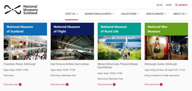
Not only was there confusion around the difference between NMS and NMoS, but some visitors weren’t certain about the name of National Museum of Scotland. It is often referred to in both speech and search by historic or colloquial names including ”the Royal Museum’ or ‘the Chambers Street museum’. A simple way to address this issue and help clarify key location info was to add the address to each museum panel in the Visit Us menu.
The navigation revamp also gave us an opportunity to improve our site search, so we’ve added a simple ‘popular searches’ feature to respond to common search terms.

Discover: Exhibitions & Events
Alongside the refreshed navigation, the first launch of our web development road map includes a refreshed Exhibitions & Events section.
Formerly known as ‘What’s on’, these pages weren’t meeting visitor needs, as became clear through the user research. The renaming was a deliberate move to be explicit and avoid ambiguity, and bring the web content in line with other communications and marketing materials.
Rob Cawston has blogged about the early research and design process which led us to this point, but the three key issues we intended to solve were:
‘What’s On’ sections were hidden beneath each museum page
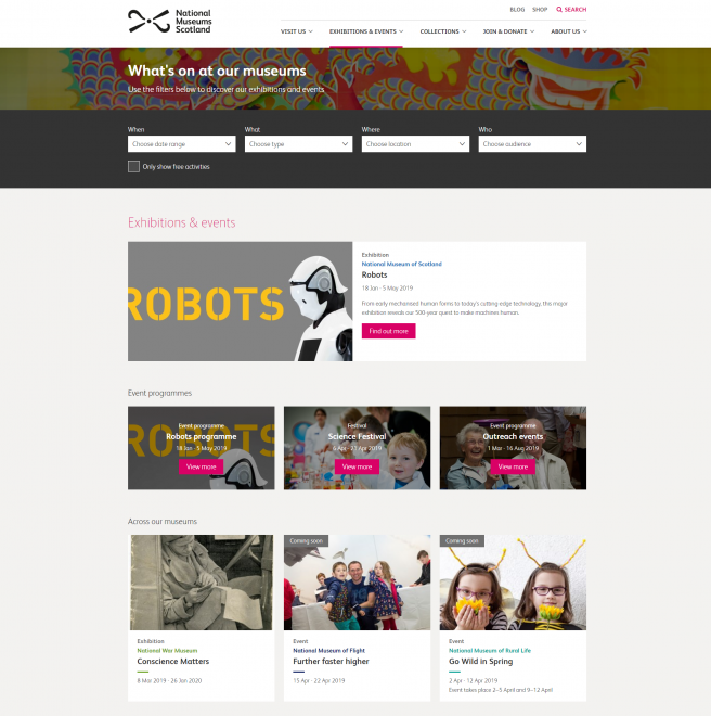
To find information on an exhibition or event, visitors had to know which site they intended to visit first, meaning less opportunity for cross-marketing between sites. The new overarching Exhibitions & Events page offers visitors a single view of all activity across all four museums.
Filters and linked events
As Chris Unitt has noted on the subject of events search and discovery at cultural institutions, there’s no homogeneous visitor behaviour to design around – people with different needs will want to browse and locate events in different ways.
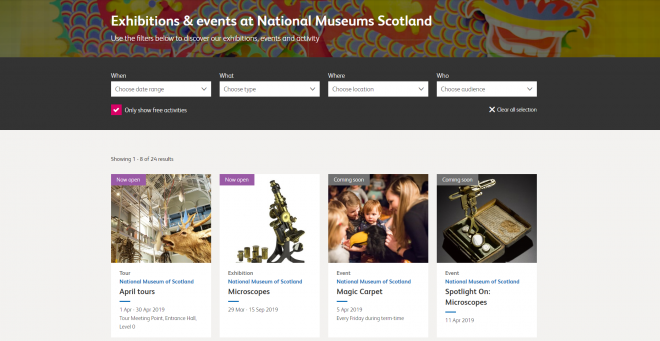
With this in mind we opted for a simple set of filters to help visitors discover activity (When, What, Where, Who), and added a date-picker (which was another simple bit of feedback from our test sessions).
We were very keen not to overload the filtering options and keep them to four core variables for simplicity and consistency with other marketing materials.
Another issue we sought to tackle was around categorisation of events. The way our Umbraco content management system was set up to list events beneath each museum meant that it was difficult to group activity together at the front end, so a simple tagging system was needed to aid discovery of content which is connected by location, exhibition, or theme.
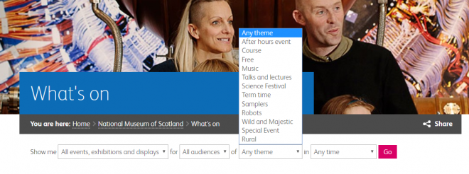
User feedback told us that the themes in the filter were unclear and inconsistent (see below), so we removed the Themes option and added them as key signposting features on the landing page.
What’s free?
Another discovery from our user testing was that visitors wanted to see what was free at a glance, so a simple toggle option has been included to provide a quick view.
What’s next?
We’ll be monitoring how people use the site and continue to iterate based on feedback, so tell us what you think in the comments below.
Next up on our road map is a rethink of our homepage and museum landing pages, which will follow in the summer.
