I’ve recently been thinking about when colour seeps into the past…
These thoughts were spurred on by a talk from Chris Wild at the Culture 24 Let’s Get Real conference this September. Chris founded a blog called Retronaut, which shares incredible images of the past that can “take your map of time and tear tiny holes in it.”
Chris started his talk by sharing that he first discovered he could travel in time as a child, whilst in front of the wondrous invention that is the television. Sat in front of a glowing square box is where Chris stumbled across Bagpuss, the children’s television show which shifts from sepia to colour when Bagpuss wakes up. Chris credited this programme as a key inspiration for his current endeavours with Retronaut.
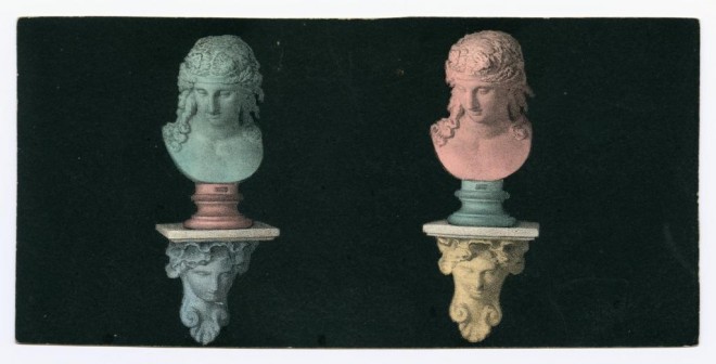
Chris’s talk was accompanied by vivid images and it reminded me that I do sometimes forget that the past was in colour! It’s such a simple thing. A default way of thinking of the past is in black and white. The Photography: A Victorian Sensation exhibition has been running since June at the National Museum of Scotland and is filled with thousands of incredibly beautiful black and white images of the past. I’ve looked at many of these images and it’s easy to slip into thinking that the landscapes were colourless, and that people’s faces were different shades of grey.
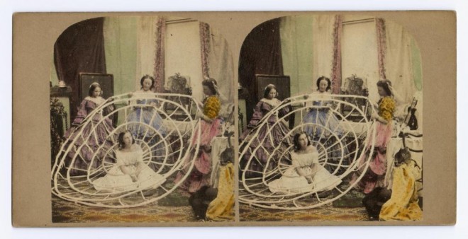
However, as Chris highlighted when he discovered the ‘Crinoline’ series of images from Photography: A Victorian Sensation and wrote a feature about them on Retronaut, in among all of the images in this exhibition, there are a few wonderful colour ones.
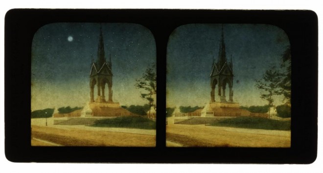
As I returned from the conference I couldn’t shake these thoughts of a colourful past from my head. I decided to delve into the Victorian Sensation photography collections that we have online and explore these colour Victorian images a little more myself. Of course, there was no form of commercial colour photography available at that time, and instead various forms of painting, colouring and tinting were applied.
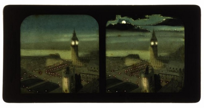
This style of photograph was introduced in the 1860s and printed on extremely thin paper, backed with another piece on which the outline of the photograph was painted in various colours. A further embellishment was to pin-prick features, which show as sharp points of light when seen back-lit in the stereoscope. So in fact, it is part painting and part photograph.
The next set of colour images I discovered were also stereocards, but this series by Michael Burr have a very different feel to them. It was ‘Patent Pulpit: Seven minutes to one!’ which first caught my attention. I couldn’t tell if the priest featured is in shock, in pain, about to sing or falling asleep.
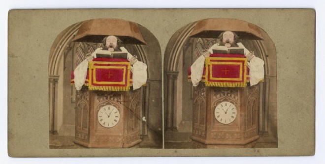
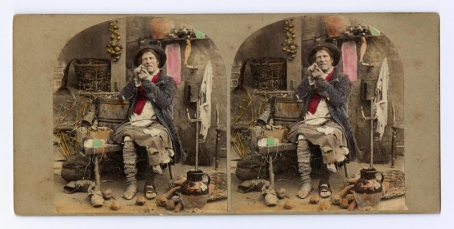
The colour in Burr’s images, rather than making the scenes seem more real, makes them more surreal. With only certain elements picked out in colour, they take on a different life, transporting you not just to a place between the ‘black and white’ past and ‘colourful’ present, but to a more fantastical region somewhere in-between time; a place where this troubled single fellow below is flushed with pink cheeks, despite the rest of his skin remaining grey. The shock of red and pink scream out and distract you from the ragged trousers and tired boots.
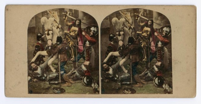
From the troubles of one, to the happiest days of another; the next images I discovered were a series by James Elliot.
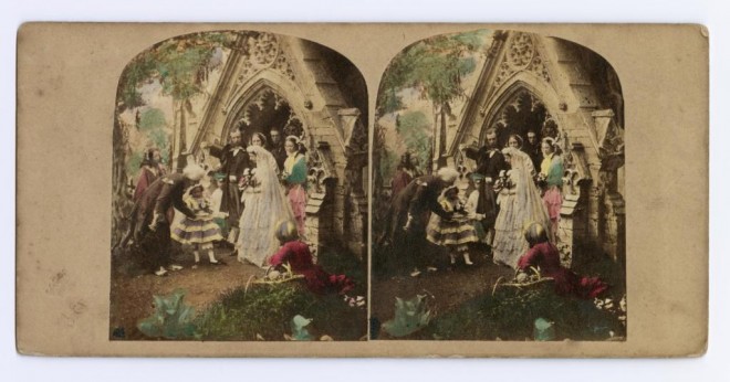
His technique of highlighting key details with colour is similar to Burr’s, but his focus is different. The camera has zoomed out to take in a whole host of scenes – from newlyweds in a church doorway, to a re-enactment of Joan of Arc, riding a white horse and fighting several men.
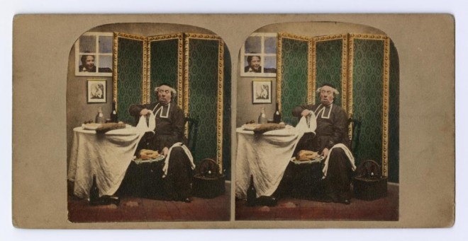
The more I searched, the more intriguing images I found. These images by Martin Laroche show a Catholic priest caught eating meat on a fast day. I love the facial expression and the bold green screen that frames him perfectly.
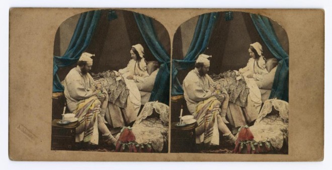
This image by Alfred Silvester depicts a rarely photographed bedtime scene. Again, the blue swathes of curtain frame the white clothed figures perfectly to create a focus on the central scene.
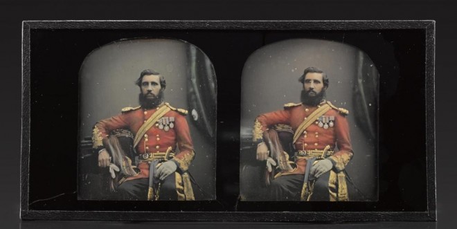
I love the bright red and gold in this image, which shows a man wearing a military uniform. It was taken by Antoine Claudet, who opened his studio in 1841 and was pioneering the colouring of daguerreotypes at this time.
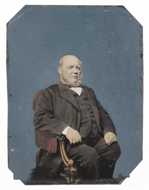
The final set of images I found were studio tintypes (a single, positive image on a tinned or enamelled iron support) and they show more traditional portrait images where almost all of the colour has been added to the scene.
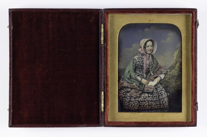
In this second image of a seated man, the added colour makes him appear almost statue-like, the grey skin and beard emphasised against the rich blue background. I really like this effect.
It’s been great to delve into this colourful Victorian photography just a little. Photography: A Victorian Sensation has also given me further insight into the development of colour photography following the Victorian period:
- 1907 Lumière Brothers manufacture the Autochrome plate; this becomes the first commercially successful colour photography product.
- 1935 Introduction of Kodachrome multi-layered colour reversal film by Eastman Kodak.
- 1963 Polaroid introduces instant colour film and cameras.
I would recommend a visit to the #VictorianSensation exhibition before it finishes on 22 November 2015. In addition to telling the story of the early years of photography, it offers a window into the social history of the period; people and faces that give a glimpse into our past – which is very colourful indeed.
