One of the things I love about museums and galleries is that they offer all kinds of learning opportunities for all.
When a museum object catches your eye and you start to wonder more about it. Then you read its short description on the print label, which surprises with some added context or meaning. This is perhaps, the most obvious informal learning that can be gained from an object and its print label.
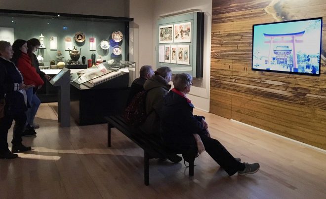
Yet, there is still room for further learning and digital gallery displays can help to do this. When considering digital displays in a gallery, there has to be an expectation that people will take a step back from the objects. That their attention has to focus on a different offer, the glowing digital screen.
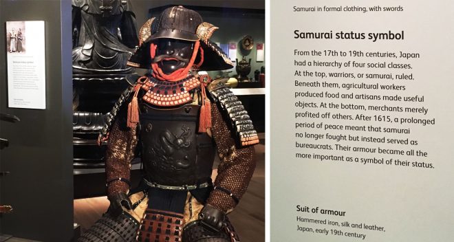
So then a few questions arise. What value do you add by bringing digital media into the gallery space? What can digital content offer that more traditional print displays can’t? How can a screen compete for attention with a Samurai Warrior uniform?
I pondered these questions often last year, as I took a secondment as Digital Producer and made a switch from creating content for online audiences to developing digital content for use in a number of new galleries at the National Museum of Scotland. I worked across a range of the digital products in the galleries and since they opened in February I’ve enjoyed popping back to see how people are interacting with them.
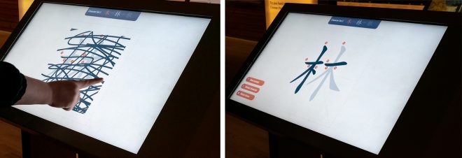
A favourite moment was watching a family try the Art of Writing interactive. A dad encouraged his three boys to take turns drawing each character and then when the youngest was left alone he started to freestyle, as illustrated below.
I planned and delivered some of the usability testing sessions for these digital interactives and this was something we had not observed during any of our test sessions! A good reminder, there are always new ways to interact with things, and digital displays can offer both direct knowledge learning and more ambient opportunities.
Delivering digital labels
I led on the content delivery for the digital labels in the three new galleries and a further two galleries refreshed as part of the redevelopment. This was a macro to micro project, which started with broad discussions with curators and mapping out project requirements, then finished with very specific text, image and film editing.
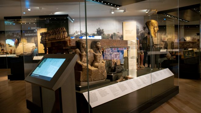
As my colleague Adam Coulson describes well in this blog post, there is often a certain mystery around what a digital label is. At National Museums Scotland, you may encounter two types of digital touchscreens in a gallery and this is how we define the difference between the two:
- Digital Label: an interactive touchscreen that runs a content management system (CMS), that is standardised and provides a fixed set of options for the visual output and interaction.
- Digital Interactive: an interactive touchscreen that runs a bespoke interactive design and experience, e.g. it might explore information in the context of a game.
Content development
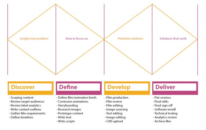
I took the double-diamond diagram created by the British Design Council as a broad framework to think about planning the content design and development for the digital labels. The list below is roughly how I divided up the different actions within the project, although these were often overlapping and repeating.
The above gives a sense of the different processes involved in working on this type of content and having had some time to reflect on this now, it is the following that led to the most successful digital label content:
- Collaboration: Our curators are our knowledge experts and brought key direction to the narrative of the digital labels. However, the final outcome you see in the gallery is the output of curatorial, learning and digital colleagues working closely together.
- Cascading: As many teams were working towards the same final deadline of the galleries opening on 8 February 2019, there were many competing priorities. This meant our key digital deadlines had to be spread out across different work schedules, and be open to some flexibility both internally and when working with external companies.
- Iterative: Our content required different stages of review and had to be open to edits throughout. This meant all stakeholders had to be open to giving and receiving feedback at different stages.
- Audience-focused: We used the target audiences identified for the different galleries to inform decisions, e.g. during the scoping period it influenced the decision to create a series of animations.
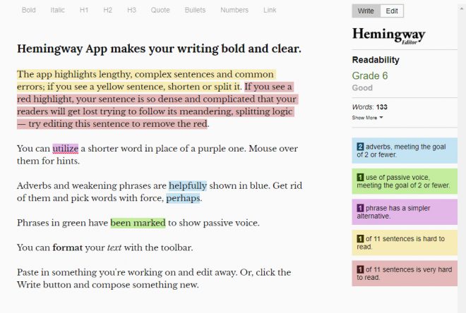
- Accessible: Our content tries to not assume a high level of prior knowledge and to use inclusive language. This influenced our choice of words and I was constantly checking label text in the Hemingway App.
- Data-led: Our digital label limits were based on analytics and research about what was working on older digital labels within the museum.
- Attention focused: Our content is edited to be succinct where possible. Technically we could have a video that plays for 20 minutes, but it’s unlikely anyone would watch it. So we tried to keep most of our videos between two and four minutes.
- Long lasting: Our content was planned with the expected lifetime of 20 years, which affects image licensing and timeframes mentioned in content e.g. there is a chart with birth years this 12 Animals animation and we had to consider the best timeframe for this so it remains relevant for most visitors over intended timescale.
Digital label content
As the digital labels CMS has standard chapter navigation, the hope is that it starts to create a more consistent visitor experience throughout the museum. There are 13 digital labels spread across the new gallery spaces and most of these consist of three chapters.
We had the choice of filling each chapter in the digital label with either a film or a text/image/film slideshow. We ended up with 15 full chapter films and 25 slideshow chapters. The choice factored in what best suited the specific story and the resources we had available. 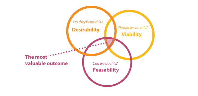
What kind of content fills the digital labels?
I was intrigued to see how much this breaks down into assets and spread across the 39 chapters there is approximately:
-
- 306 images
- 10,000 words
- 15 videos
- 4 animations
We chose to commission some new rich content to tell stories that would have been tricky to do without some creativity and I was really pleased with a series of animations we developed with HeeHaw for use in four of the digital labels.
I led the development of new films being captured in-house and also got stuck into editing videos we cut down from existing footage or sourced films.
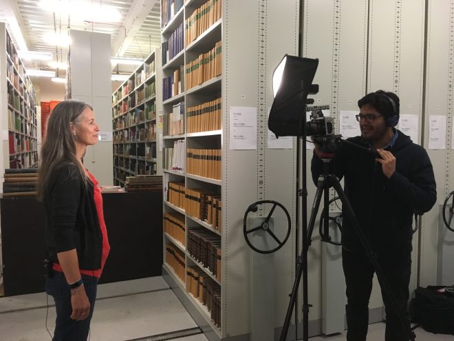
Below is an example of a film produced in-house that forms one digital label chapter in our Ancient Egypt Rediscovered gallery. This film was aiming to explore how archaeology in Egypt has changed since the ‘Qurna Queen’ excavation in 1908.
This second film shows how a Korean lacquer box was carefully prepared for display in the Exploring East Asia gallery.
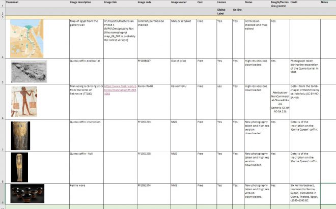
The other main significant factor in terms of cost and time was image sourcing and editing. This varied depending on the source and we kept track of our images in a series of spreadsheets that record sources, actions required and copyright permissions.
Planning a similar project?
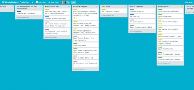
In terms of planning and organisation tools, I mostly used Trello, Asana, Excel documents and organised project folders to keep track of things.
Also if you are planning to have interactives installed and have the opportunity to network them in a secure way, then it should definitely be considered. As these digital labels are linked up to a server, we can connect to them remotely and this meant we could run trials and tests from our desk during install.
Here are a few other things I think should be considered when thinking about using digital labels in a gallery project.
Organisation pros/cons
- Can represent different perspectives e.g. external experts can feature in films.
- Can edit content easily on the CMS during the production process.
- Analytics from labels can inform what content is viewed over time and inform future development.
- If gallery computers are networked, content can be tested and edited remotely in future.
- If planned correctly, some content assets can be reused online.
- There is ongoing technical upkeep and maintenance to consider.
- Location is important, but it isn’t always possible to locate in front of the object in discussion.
Audience pros/cons
- Can benefit from less ‘written’ interpretation.
- Can delve a little deeper and discover a little more about a subject.
- An opportunity for additional visual context, beyond the visual of the object.
- Added depth and richness to engagement experience.
- A level of digital literacy is required.
- Active participation is required to view the content – you have to navigate through the screens.
Reflections
I worked on this project for just over eight months and really enjoyed getting the opportunity to take a slight change of focus, to work alongside new people in the museum and to develop lasting output that will be on display for a number of years.
I’ve also enjoyed re-purposing some of the gallery content for use online and I’ve started to build a number long-form stories (Theatre district handscroll or this Korean lacquer box) that use the content developed for the digital labels or digital interactives as a base.
Further reading
Data-led design: Using visitor behaviour to inform touchscreen content
Content Design – Sarah Richards

