

As summer turns to autumn we’re busy preparing for the opening of the new ancient Egypt and East Asia galleries at the National Museum of Scotland in spring 2019.
In the Digital Media team we’ve been scoping, story-boarding, commissioning and writing lots of new content which will feature on touchscreens in the galleries. To help us we took a deep dive into the behaviour of our current visitors to understand how we can create the most appealing and interesting stories.
Building on a recent blog post from the Museum of New Zealand Te Papa which outlined their insights into the topic, we wanted to share our findings to help others who are producing similar in-gallery content.
What’s in a name?
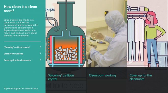
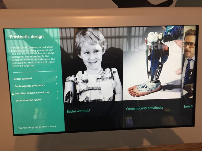
Through discussion with museums colleagues it became clear that there is no single term to describe the digital touchscreens in museums and galleries. Various people inside and outside of the museum refer to them as ‘digital exhibition labels’, ‘screens on gallery’, ‘touchscreens’, or’digital labels’ (which is the preferred National Museums Scotland terminology).
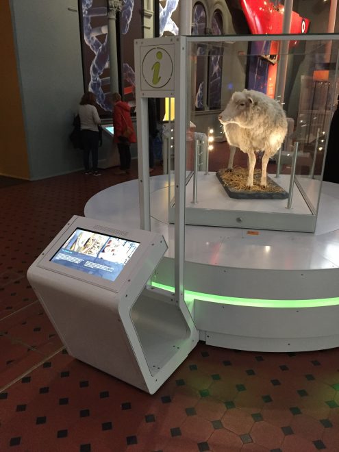
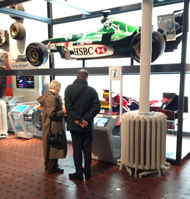
These names were new to me when I arrived here at the museum, so for clarity, all these phrases simply refer to the interactive touchscreens positioned by objects in a museum. They provide a way for visitors to explore information about the objects and stories on display, and visitor feedback tells us they’re popular as they help provide a blend of interpretation and allow visitors to discover more at their own pace.
What we looked at
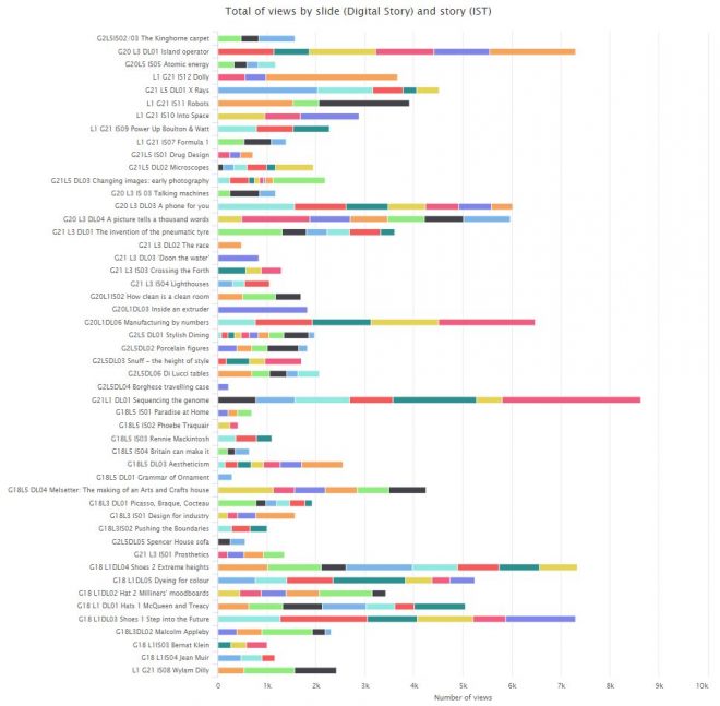
Our research focused on numbers. Access to analytics data meant we could look at the number of people tapping each screen. This allowed us to interrogate which labels, chapters and content were most popular, and draw some insights which could be applied to the new content.
It took a bit of trawling through the data – we have over 50 labels running through the same content management system (CMS) with data available for each at various levels of complexity – but we were able to spot patterns in behaviour and some some surprising results.
We also tested the findings with our learning enablers and visitor experience staff to get a ‘real world’ view on the numbers, as there were some curious outliers with incredibly high view counts which were due to activity driving footfall like schools trails.
The technical bit
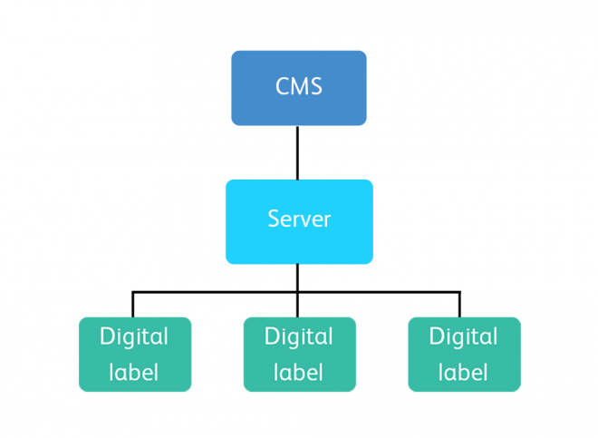
Our digital labels run on a customised Umbraco CMS which was built for a previous gallery project in 2016.
Each digital label tracks key interactions including taps on each chapter, video plays, screen timeouts and taps on the ‘attract’ screen (which displays when the label is not in use). Each digital label sends a daily log file of this data to our server which can then be accessed by the CMS.
In a visual sense, the CMS provides a framework to ensure a standard content format across all digital labels, meaning the layouts and chapter structure is consistent.
Assumptions
Before looking into the data, we had some assumptions which we wanted to test, such as:
- If visitors were offered a choice between static (images and copy) and motion-led content (video or animation), they would choose motion;
- The most popular museum objects would drive the most engagement with the labels close by;
- Visitors would naturally find the most ‘interesting’ stories regardless of structure.
A few caveats
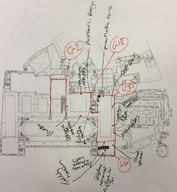
We had access to data in some galleries, but not the entire museum
Analytics data was only being tracked on the labels which ran through our existing Umbraco CMS setup, so this covered around five galleries.
The data covered a limited timeframe
The complexity of extracting raw data from the CMS in csv files (it’s not as easy as Google Analytics) meant the research only covered the relatively quiet period between September and October 2017. For a more robust analysis we intend to re-run the numbers once we have a full year’s data.
Context is key
For the purpose of our research, we focused on correlations between content types, titles, and the location and positioning of the labels.
However, the single biggest factor affecting engagement levels is very much a non-digital factor – is the object or gallery popular with visitors or not? Every object is unique, so while trying to draw comparisons in visitor behaviour there are no like-for-like comparisons when it comes to objects in the museum.
What works, and what doesn’t?
1. Location and positioning is key
We found that location was the single biggest factor in influencing label views. The data confirmed that objects (and therefore digital labels) closest to the most common museum entry points saw the highest footfall, and therefore label engagement. This contrasted to our assumption that labels next to the most popular objects would see more views.
The orientation of the label screen also played a significant role. The labels which were angled away from the visitor’s eyeline as they stood in front of an object had fewer views.
The direction of the digital label also played a part in how visitors interacted. We found that labels facing visitors as they entered a gallery would benefit from more views, whereas those angled away from oncoming footfall were more easily missed.
The same logic applied to the rest of the visitor journey through the museum, so digital labels on the ground floor would see more engagement than the first floor, and the first floor more than the second floor etc. So, contrary to our assumption, visitor flow had a greater influence on label popularity than the objects or content on the labels themselves. The data allowed us to visually map out common visitor routes, which made for interesting reading.
[Edit: This is backed up by Amos Mann, Digital Producer at Museum of New Zealand Te Papa who presented a number of insights on the topic including “the single greatest influence on the reach (conversion rate) of a fixed-location digital product is its spatial positioning“.]
2. Content order is more important than content type
We also assumed that the content we considered to be interesting would be found and enjoyed by visitors, but the data dispelled this myth.
Visitor behaviour was linear as they progressed through chapter screens, regardless of which content types were offered to them. This was a key lesson in how we are story-boarding the new digital label content.
3. Visitors respond to content which is explicitly related to the object in their eyeline
Visitors more commonly tapped into chapters which used an image of the object in front of them.
Telling stories about the history and cultural significance of an object is great, but if you don’t make an explicit visual connection on the top screen, visitors may not make the quick connection that the digital label is related to what they’re looking at, and move on.
4. Less is more
Just because you have unlimited space doesn’t mean you should fill it! Curators who are pressured to cut down their copy for physical object labels will understandably jump at the chance to publish more content on a digital screen if given the chance.
However, the data told us that visitors were rarely scrolling beyond the initial chapters presented on the menu screen. Many labels had four or five chapters, but visitors mostly didn’t get beyond three.
What does this mean for the new galleries?
It means we’re much more informed about how we can create content for the new galleries, and make better decisions about how we format and present content to give it the best chance of being seen by more visitors.
We’re planning the new content with these principles in mind:
- Ensure label hardware is positioned and oriented with visitor flow in mind.
- Order chapters to highlight the richest content first (eg, if you’re delivering detailed graphic animation, make sure it’s likely to be seen).
- Make labels as explicit as possible – make a visual connection between the object and the label content (particularly the first chapter).
- Think ‘less is more’. Making visitors work hard to find content in a deep structure is a bad idea. A clear top-line chapter structure is much easier to navigate.
We’re looking forward to showing off the new stories early next year, so come and see us in spring 2019 and let us know what what you think.
Do you have any tips or best practice? Share them in the comments below.
Links
- How your behaviour has changed the way we make digital exhibition labels, Karyn Brice, Museum of New Zealand Te Papa (2018)
- National Digital Forum, Amos Mann, Museum of New Zealand Te Papa (2017)
- Digital Exhibit Labels: Balancing Opportunities and Challenges (includes an excellent reading list of further resources), Sarah Walsh Angus (2015)