Colour is absolutely everywhere, but do you always see it? Do you have a favourite colour?
Over the years there have been a number of dazzling shades that have caught my eye. I can still vividly remember being surrounded by the emblematic blue Monochromes of Yves Klein at the Pompidou circa 2006. It felt like being plunged headfirst into an immense pot of blue paint. The colour purple evokes elegant yet offbeat and quirky feelings for me, as I often associate it with the Jenny Joseph poem Warning which starts, “When I am an old woman I shall wear purple.” However, when it comes to my favourites, those spots are firmly reserved for yellow and teal.
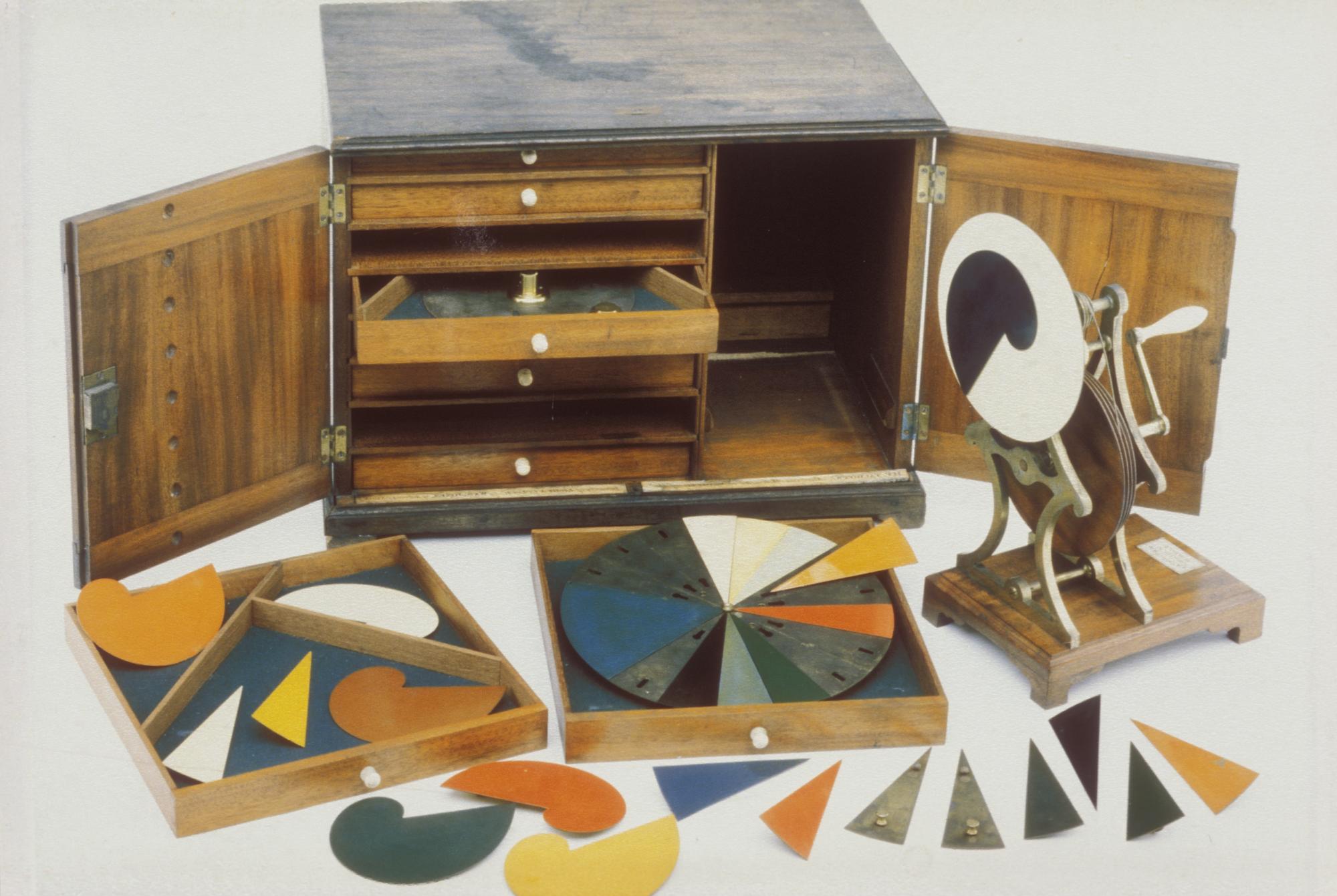
When contemplating the colour yellow, I’m not totally sure of the origin of its positive associations for me. I don’t think it has anything particularly to do with yellow butter, bumble bees, turnips or taxis, nor saffron, sweetcorn, bananas, buttercups or daisies.
Perhaps it could be the yearly awakening of daffodils, or years of studying surrounded by idea-filled yellow Post-it notes. Perhaps. What I do know is that I have a tendency to light up when I see things that are the colour yellow. It’s as if my eyes spring open and a switch flicks on in my mind to say ‘like’.
“In visual perception a color is almost never seen as it really is — as it physically is. This fact makes color the most relative medium in art. In order to use color effectively it is necessary to recognize that color deceives continually. To this end, the beginning is not a study of color systems. First, it should be learned that one and the same color evokes innumerable readings.”
Josef Albers in the Interaction of Color via Brainpickings: The Magic and Logic of Color: How Josef Albers Revolutionized Visual Culture and the Art of Seeing
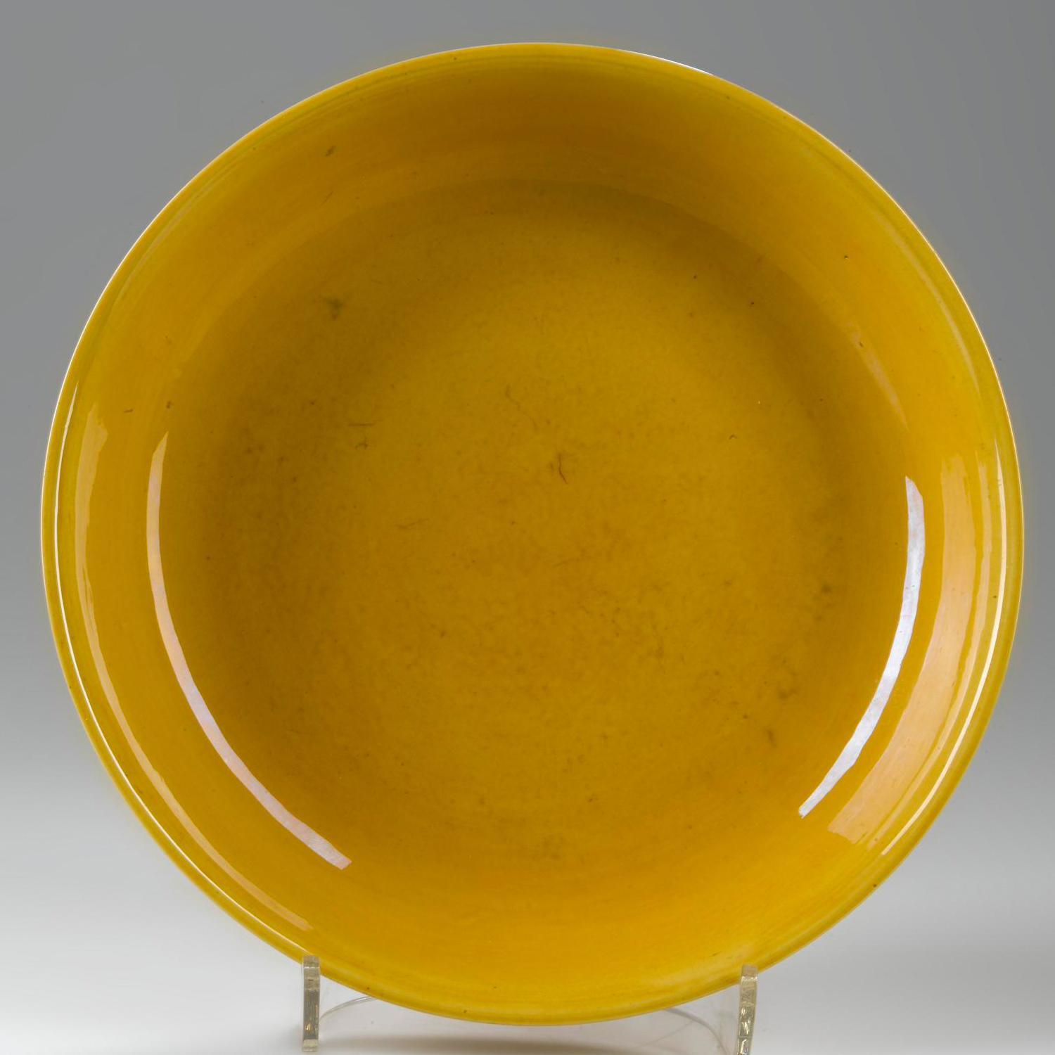
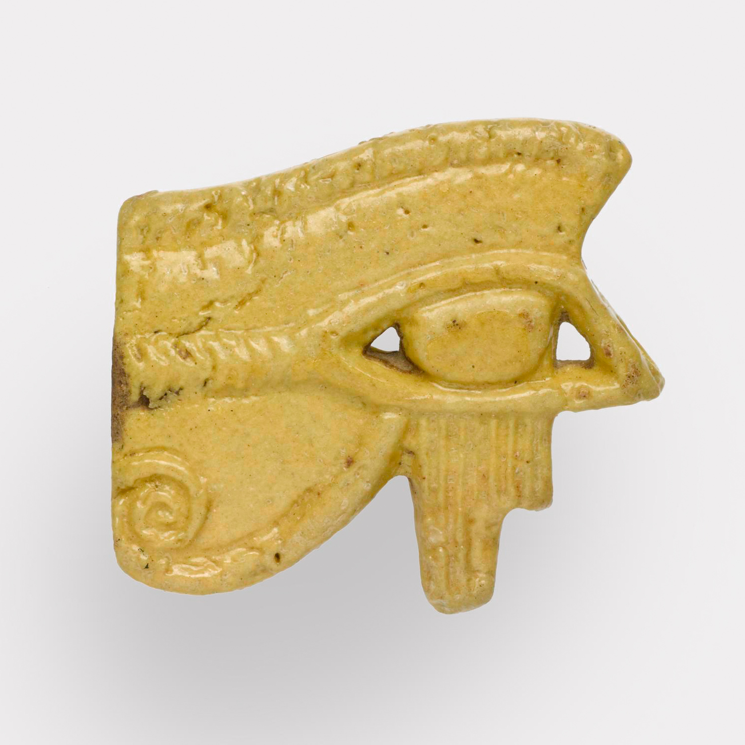
I started wondering what yellow coloured objects I might find in the museum collection. The Spring Equinox was earlier this week and despite that being followed by a little snow here in Scotland, I thought this was a good reason to go on the search for yellow! I started by walking around the galleries, then followed this by adding some items to this Pinterest board. I was happy to find a vast and varied collection of objects in wondrous shades of yellow.
Layered yellow
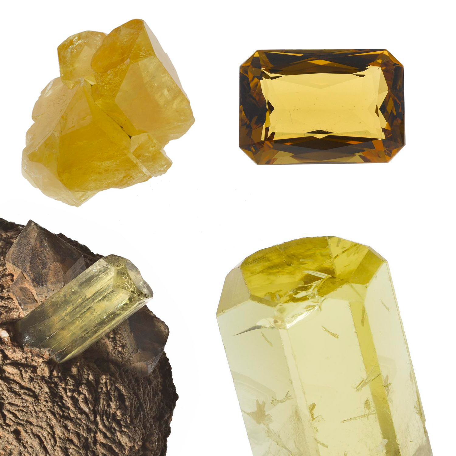
Beryl was a new one for me. I found it amongst a glorious shelf of minerals in the Restless Earth gallery, and I now know that emeralds and aquamarine belong to the Beryl family. I like the way the light catches these different samples. When discussing yellow, Goethe wrote:
“This is the color nearest the light. It appears on the slightest mitigation of light, whether by semi-transparent mediums or faint reflection from white surfaces. In prismatic experiments it extends itself alone and widely in the light space, and while the two poles remain separated from each other… In its highest purity it always carries with it the nature of brightness, and has a serene, gay, softly exciting character.”
Johann Wolfgang von Goethe, Theory of Colors, 1810. Via Brainpickings: Goethe on the Psychology of Color and Emotion.
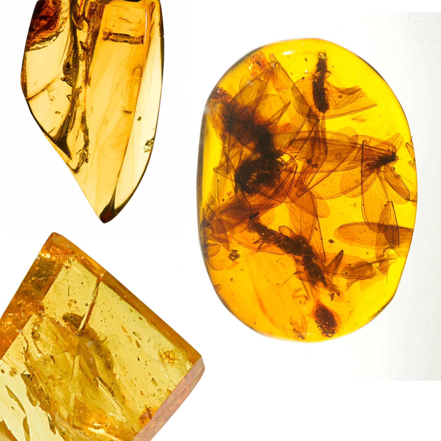
There are a number of amber fossils in National Museums Scotland collection and this sense of bright wonder definitely relates to them also. The light and shadow from the fossilised insects contained within defines the colours I see, as various shades of warm yellow appear in the places the light flows in and through.
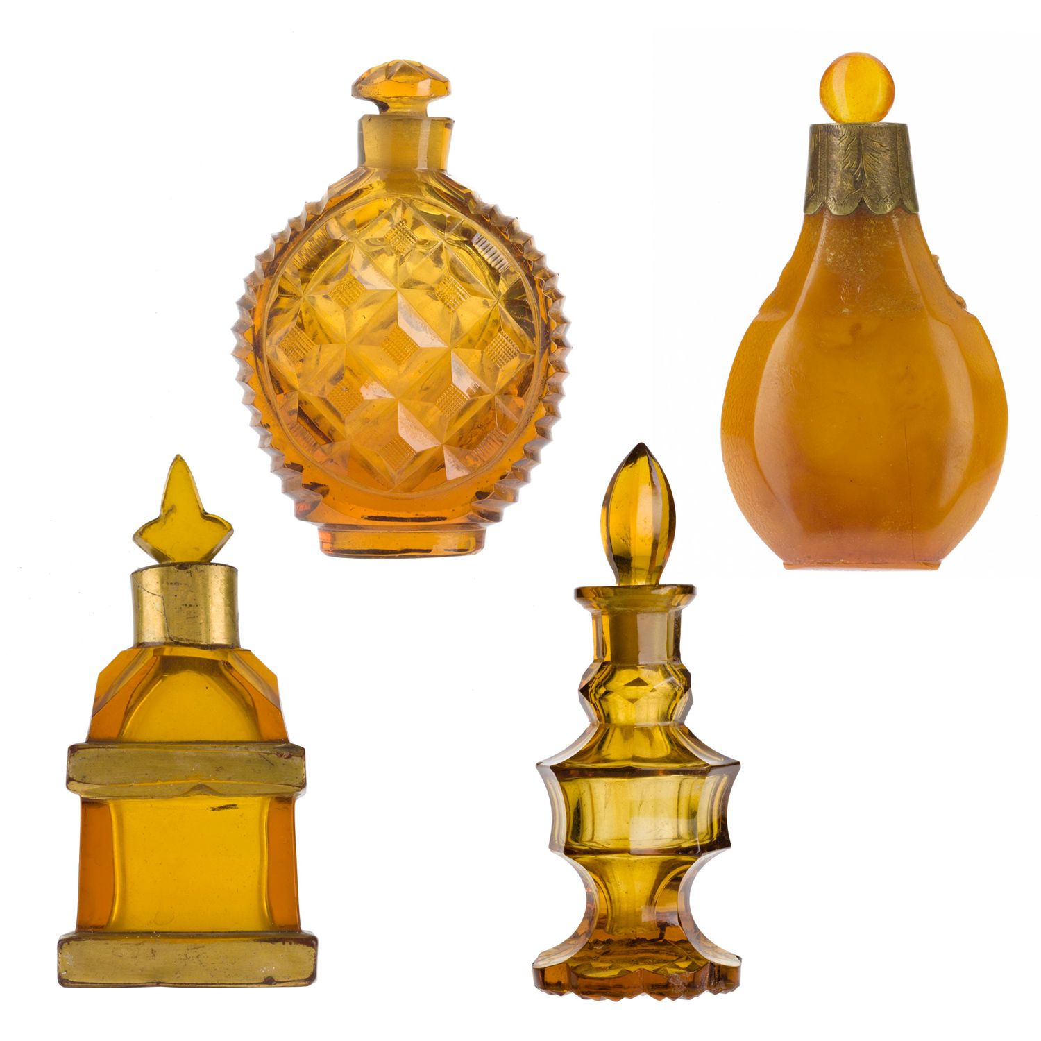
After looking at fossilised amber, I then discovered some more recent amber items – these wonderful scent bottles. In 1971, over 300 beautiful scent bottles collected by Ida Pappenheim were donated to National Museums Scotland. The shapes of these bottles catch the light in a number of different ways, presenting a number of different amber yellow tones.
Volcanic yellows
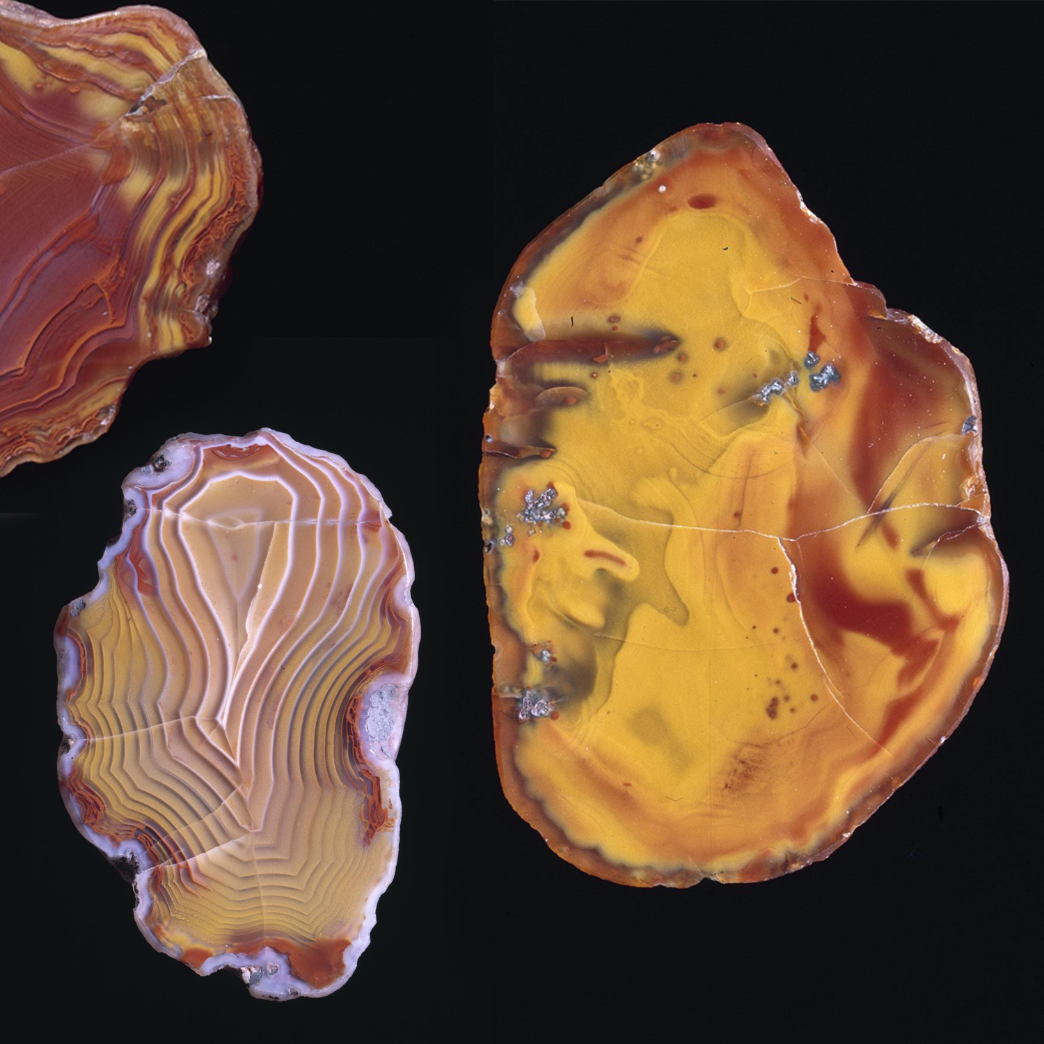
I find the shapes and colours in these agates to be somewhat mesmerising; it’s almost as if each one tells a unique story. The yellow in the sample on the right is a rich yolky egg colour, although diluted in parts by the darker red elements. In the Natural World galleries I learned that agates are rocks that form in the gas pockets of old lava flows. On the outside they can look dull, but cut them open and beautiful patterns can be revealed. Agates form part of Professor Matthew Forster Heddle’s collection; he studied the processes that formed agates and published two papers on the subject. Explore the Heddle collection here.
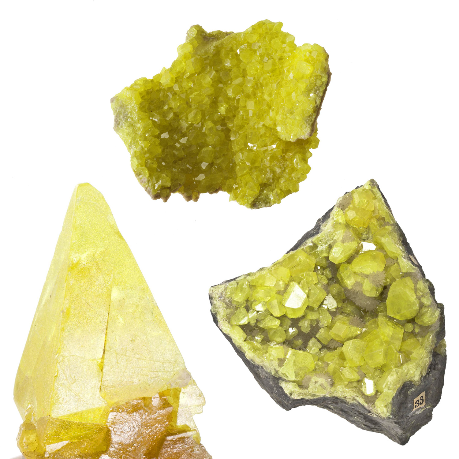
A completely different neon shade appears in these distinctive Sulphur samples from Italy. It’s more the colour of a highlighter yellow – which is not necessarily bad, but after a while it may make your eyes hurt. The eye-catching shade hints at the more dangerous side of this element, as the biggest modern use of sulphur is to make corrosive sulphuric acid, H2SO4.
Colourful contrasts
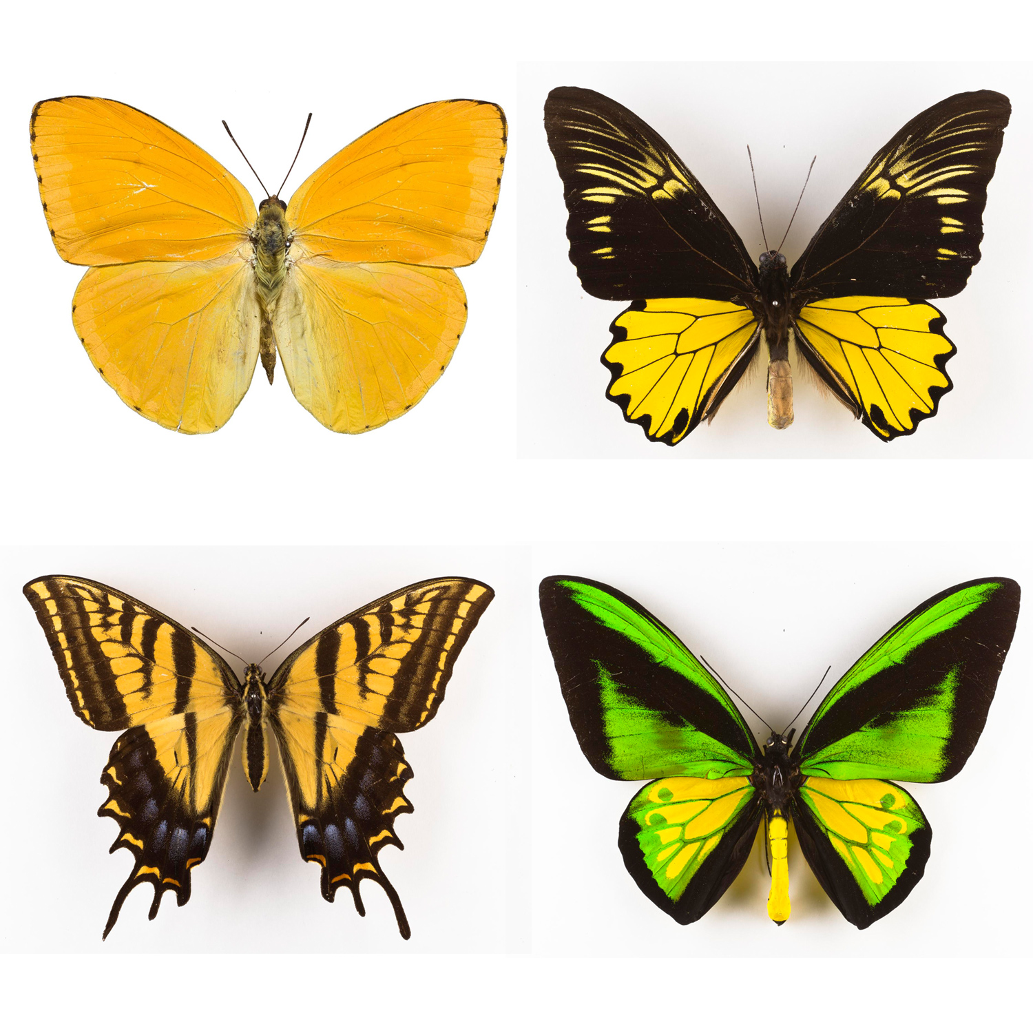
Then I discovered a range of beautiful butterflies that hail from Mexico, Paraguay and Indonesia. I like the warmth of the yellow on the Sulphur butterfly, although it’s also amazing the way the yellow jumps out at you in contrast to the green on the Goliath birdwing butterfly and the tail in particular is very attention grabbing. This video discusses the Bezold Effect, where a colour’s hue is affected by what is surrounding it.
The Bezold Effect (Part 4) from Josef and Anni Albers Foundation on Vimeo. This short video, created by the Josef and Anni Albers Foundation, combines audio excerpts from Josef Albers’ lecture “The Logic and Magic of Color” (University of South Florida, 1966) with animated plates adapted from Interaction of Color.
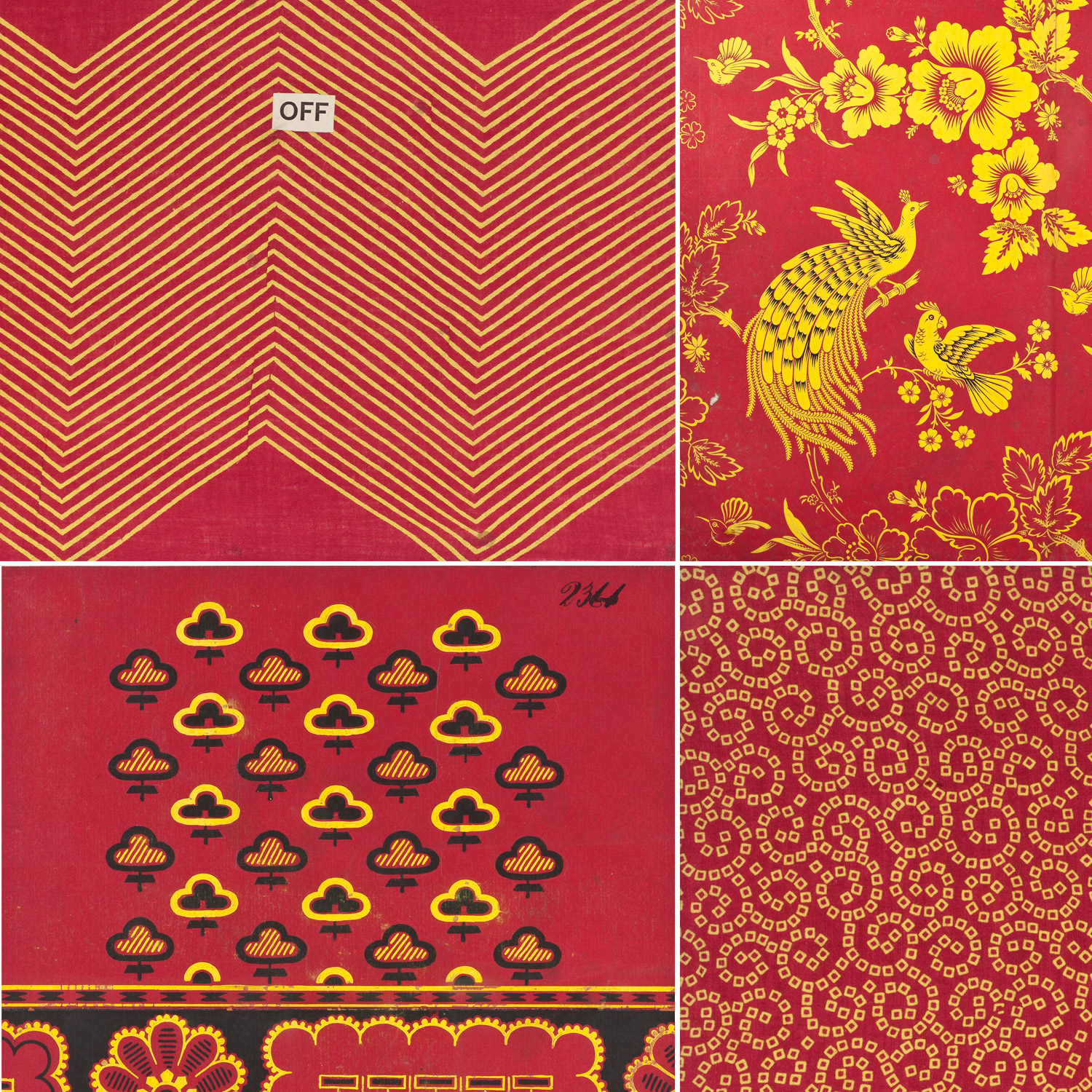
National Museums Scotland holds a stunning collection of fabric samples and pattern books from the Turkey red factories in the Vale of Leven. I put together this selection of four samples, as I think the yellow elements jump out from the vibrant red textiles in different ways, depending on how bold the print pattern is and the quantity of yellow in relation to red in the samples. See further examples of the textiles produced and find out more about the history of the Turkey red industry here.
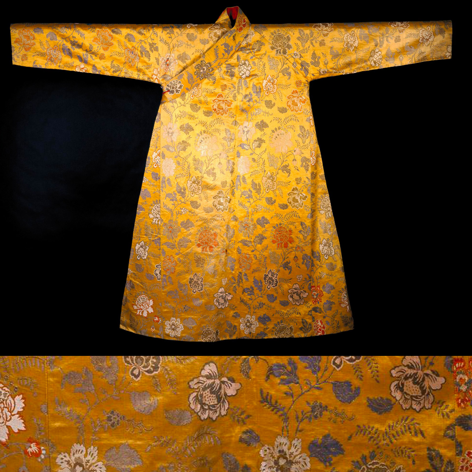
On this woven yellow silk robe, the opposite effect occurs. The golden yellow dominates as a base colour, but the varied details and colours that are layered on top of it are what catch my eye.
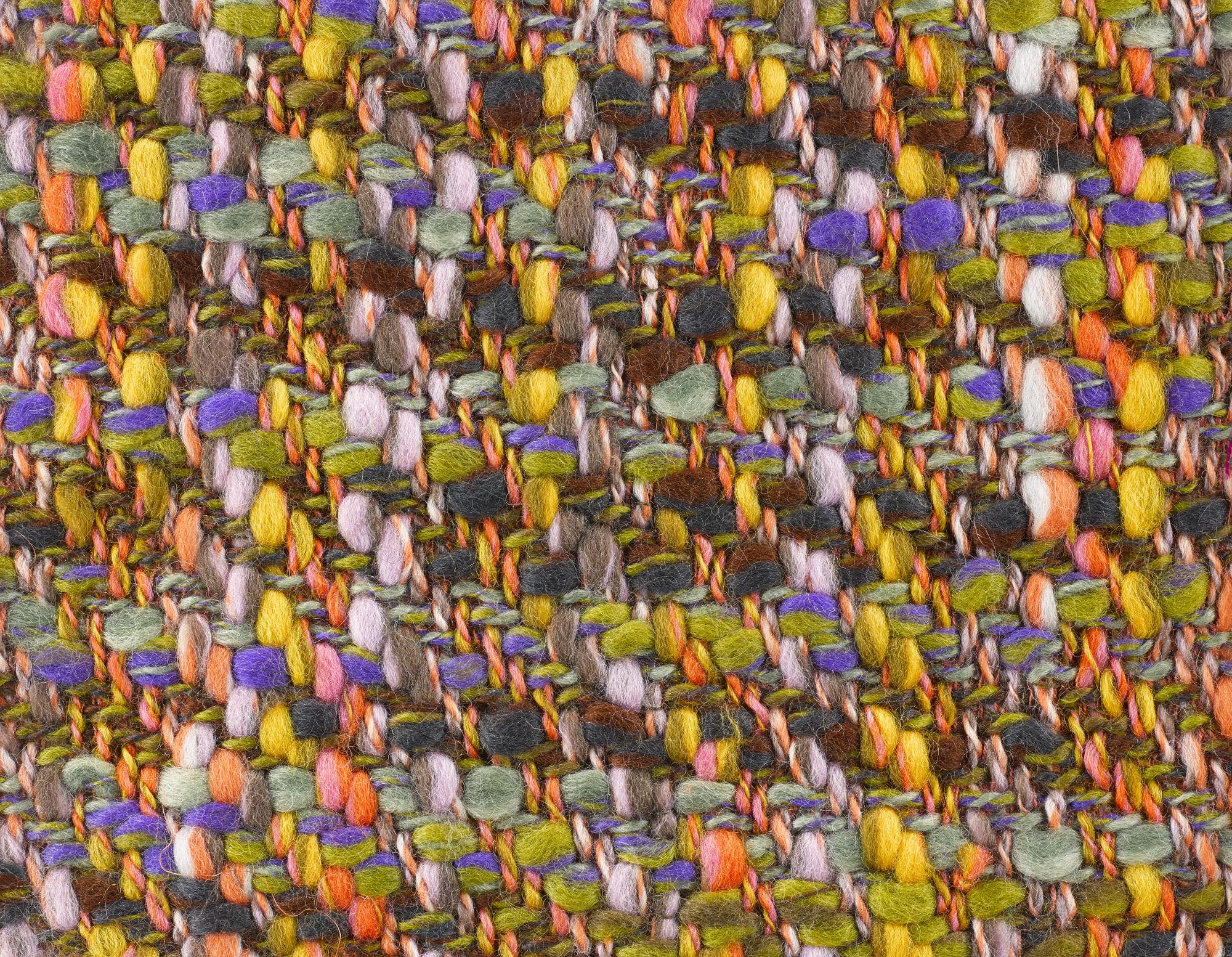
I think now I’m so consciously looking for yellow that it jumps out in this sample from Bernat Klein’s collection. However, I am trying to hone in on the areas in this sample where the yellow has different colours next to it, to see what effect it has on my eyes. What do they do to yours? Based in the Scottish Borders, Bernat Klein’s radical use of colour blending and texture transformed haute couture and home-made fashions. Find out more about Bernat Klein here.
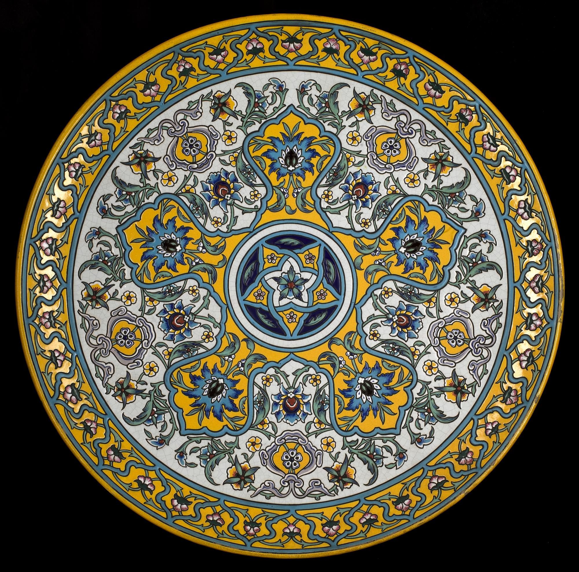
This stunning large plate is on display in our Design for Living gallery at the National Museum of Scotland. I went to stand in front of it for a minute or two to take in some of the colours upon it. The yellow and teal is a brilliant combination, for me the yellow is very dominant, popping out in rich warm tones.
My favourite
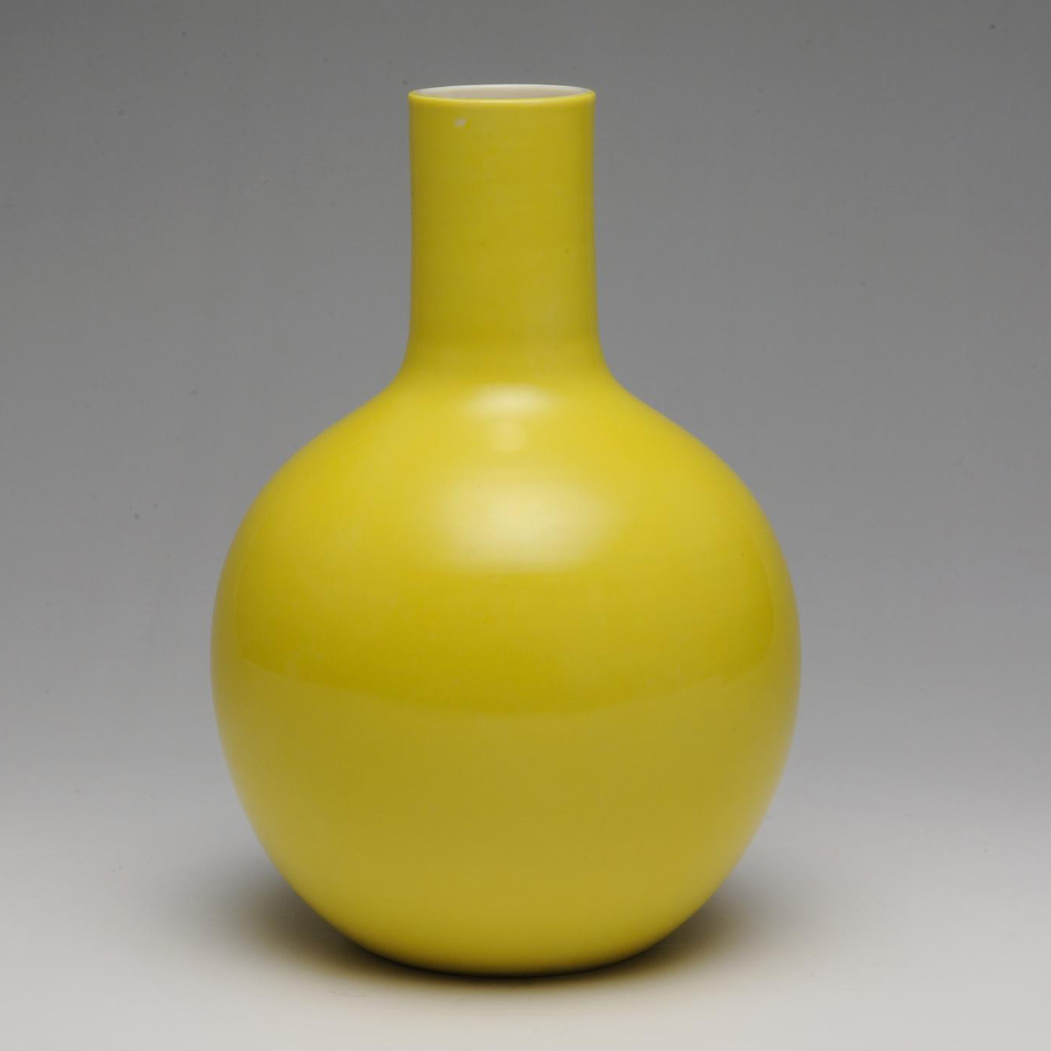
Finally, this yellow vase is possibly the favorite yellow item that I found in the National Museums Scotland collection so far. There is something about the minimal shape and bright tone of the yellow that in my eyes is just wonderful.
When I discovered this vase on National Museums Scotland collections search, it links to this earlier blog post by Dr Rosina Buckland: Senior Curator, East and Central Asia. She discusses the vase in the context of the small temporary display Masters of Japanese Porcelain held in 2015. The display showcases a remarkable group of East Asian works of art acquired from collectors David and Anne Hyatt King, which comprises 342 Japanese ceramics, seven Japanese paintings, and 74 Chinese ceramics.
The more I think about yellow, the more I realise what I don’t know about it. As I started writing this post, it suddenly struck me that I know very little about this colour that I hold in such high esteem. However, I’m glad that the museum collections has started to fill in some of the gaps.
So now back to my initial question. Do you have a favourite colour?
If you do, perhaps you should take a walk around our museum and let us know where it is highlighted in our collections on display. Share it with #MuseumColours and remember to tag @NationalMuseumsScotland on Instagram or @NtlMuseumsScot on Twitter in your post.
