I’m a 2D designer with the Exhibitions and Design department at National Museums Scotland. ‘2D’ means that I’m responsible for designing all the ‘flat’ elements of the exhibition, such as graphic panels, object labels, wall graphics, banners, etc. But I don’t ever really think like that when I’m designing for an exhibition; I see it all very much in ‘3D’ in my head as I go, considering how each item fits into the overall space and narrative of the project. We are telling a story after all, that needs a coherent beginning, middle and end, so that’s how I see it in my mind, and how I tackle it from a practical point of view.
On Photography: A Victorian Sensation I worked very closely with my colleague, Esther Titley, our 3D designer (more on that in her own words later) to organise and flesh out the story within the space, taking her elevations (the walls and flat spaces of the exhibition) and adding my own designs to them, to build up a detailed picture of how the finished exhibition would look. In the early stages we discussed textures, colours, materials, things that inspired us, initial ideas; then put them together to create a concept for the exhibition.
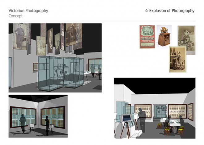
The concept then went through many changes as we responded to comments and tried to match our expectations with the realities of time, space and budget! Then, once the concept was agreed, it was on to the task of taking all the content from the curators – objects, text, images, etc. – and fitting it into the spaces we’d created. A fair bit of editing took place as we tried to make what is sometimes quite complex information easy to read, and ordering and labelling in cases simple to follow. I also had to take into account accessibility, so text had to be clear, large enough to read from a distance, legible for those with sight impairments and at the right height and angle to see from a wheelchair. Colour tests and samples were made to test in the conditions of the gallery. The light levels for Photography: A Victorian Sensation have to be quite low to protect the objects, so testing for legibility was crucial. A subtle change of colour on the main graphic panels, quite ‘modern’ in contrast to the subject matter, helped separate each section of the exhibition from the next. This echoed the marketing campaign, with its neon flashes of colour contrasting with the sepia tones of the photographs themselves.
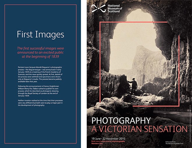
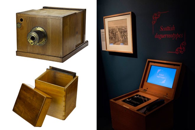
Each element was considered separately, but had to fit in with the overall look and feel of the exhibition. We took inspiration from the objects themselves – the daguerreotype cases with their plush, coloured velvet interiors, the mahogany box cameras, the elaborate stereo-viewers with their brass fixtures and fittings and the ornate type on the reverse of the cartes-de-visite. For example, the audio boxes featuring commentary from experts in the field were inspired by the box cameras and stereo-viewers. The mahogany-effect finish was complemented by an engraved text panel, rather than an ordinary inkjet-printed panel, their tripod legs mimicking the traditional stands used by an itinerant (travelling) photographer. The boxes were then titled using a Victorian style ‘flourish’ on the wall above. The audio boxes are a great example of where 2D and 3D design collaborate closely – although a special mention has to be made for our talented in-house technicians who lovingly crafted each of the boxes from the original design!
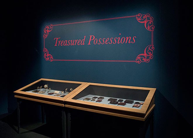
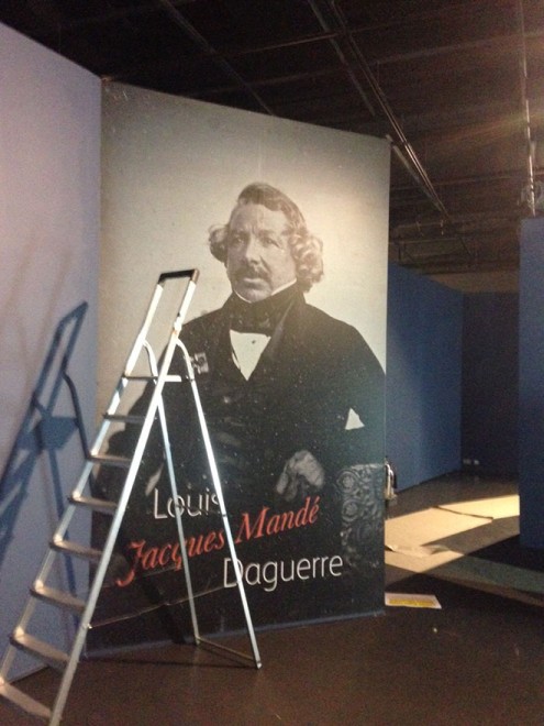
While we didn’t want to make the space feel too ‘Victorian’, we were keen to put visitors in the picture and used lots of large-format graphics to do this. The big personalities of the story – Louis Daguerre and Henry Talbot – loom above you as you listen to the first film. Indeed they loom large over the rest of the story, so it seemed appropriate to give them such prominence. Voiles (translucent fabric) printed with engravings from the Great Exhibition of 1851 evoke the grandeur of the event without dominating the space. The backdrop to the Victorian drawing room cases allows the visitor to see similar objects in context. Finally, the beach photographs of the final section are a life-size reminder of the enduring popularity of the beach holiday and the holiday snap.
I could waffle on for hours about the design process, but in the end the objects are the stars of the show, and as an exhibition designer you strive to help them shine, to let them tell their own story, so to speak. Working with such beautiful and diverse collections – and our brilliant in-house experts who research, conserve and care for them – was a privilege and a joy. I have learned a lot about early photography over the course of the project. What strikes me is the detail in these early photographs. They offer a startling glimpse into the lives of others long gone. They make me wonder what their stories were, and ponder how obsessed we still are over capturing our own image and the world around us. That is my absolute favourite part of being an exhibition designer – helping facilitate that connection between object and visitor, past and present, culture and identity. Good exhibition design does that without dominating or distracting; but make no mistake, we still want visitors to think, “Well, that was beautiful”, when they leave!
Photography: A Victorian Sensation is showing at the National Museum of Scotland until the 22 November.
