We’ve made some design changes to the National Museums Scotland Blog to keep it evolving – and make it easier to find the stories you care about.
The new National Museums Scotland blog was relaunched back in December 2014. It was a huge improvement on the old WordPress.com site, providing a renewed focus on our high-quality imagery, better access across multiple devices, and much greater flexibility for our team of editors.
Like our previous “Feast bowl” blog, whose name was taken from the Feast Bowl from the Cook Islands, which stands in the centre of the National Museum of Scotland’s Grand Gallery, the new blog has continued to bring together a mix of subjects, voices and stories to share with all comers.
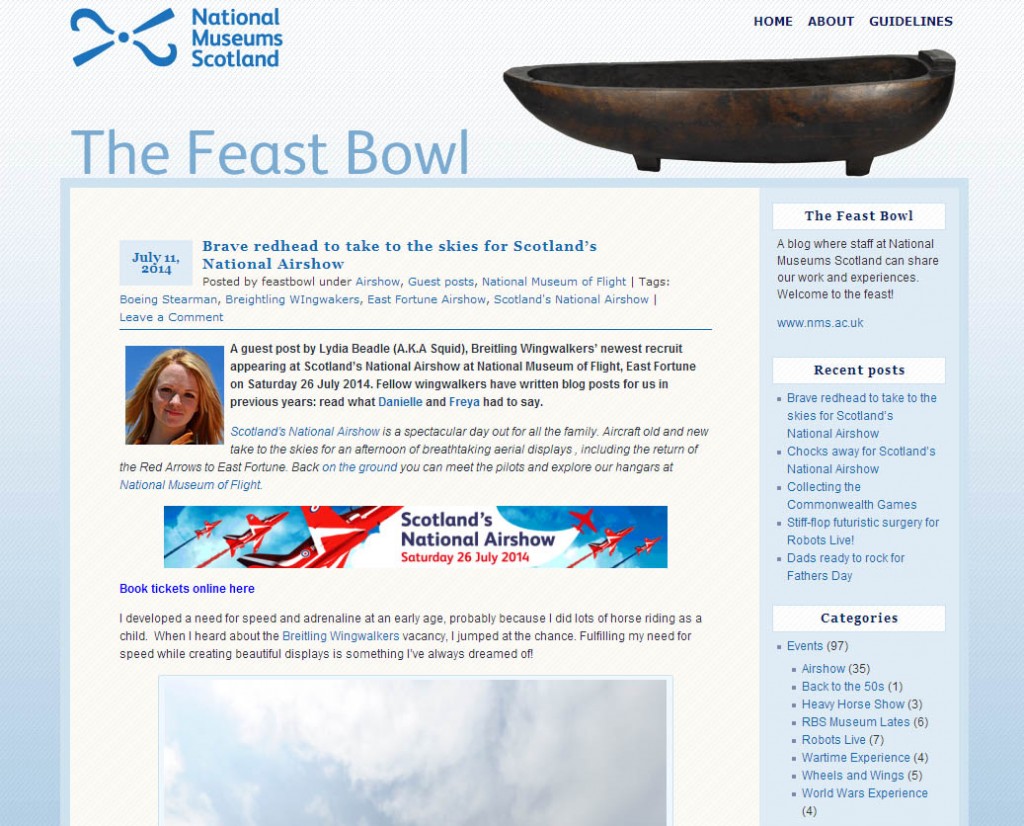
However, a number of factors have impacted on the original design, including:
- Double the number of posts online;
- An increase in regular traffic;
- More diversity in subject-matter and authorship.
Feedback from both the editorial team and front-end users indicated a growing confusion (albeit minor) about how to navigate the blog, in particular how to find posts under a specific category or tag or by a particular author.
As a team we’re on a bit of a roll after launching the new Explore section a few weeks back (you can read more about Explore in this post). So, as part of a cycle of continuous improvement, we’ve worked again with the digital design agency Mud to make some simple user interface changes, improve the navigation and iron out some of the quirks.
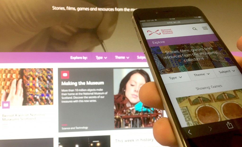
Here are some of the other blogs and websites we looked at for a bit of inspiration:
- The large, simplified drop-down menus of the Science Museum blog and sites like New Lab
- The clear categorisation of posts by the Cooper Hewitt blog
- The simplified homepages of magazine sites like Wired UK.
And, here’s a quick run-down of what we’ve changed and why…
Menu and navigation
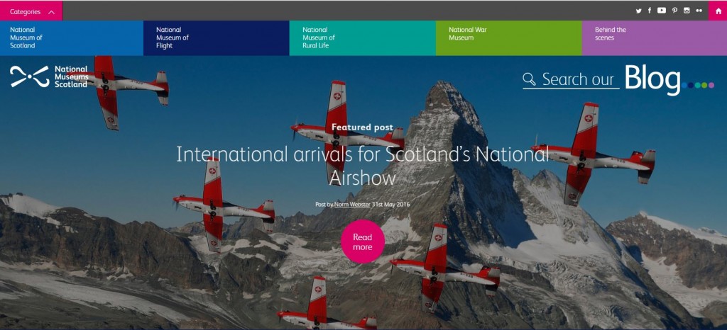
This was potentially quite confusing before: a drop-down menu of five of the ten blog categories (echoing the design of the main museums’ website), and a jumble of social media links and a home icon in the top menu bar.
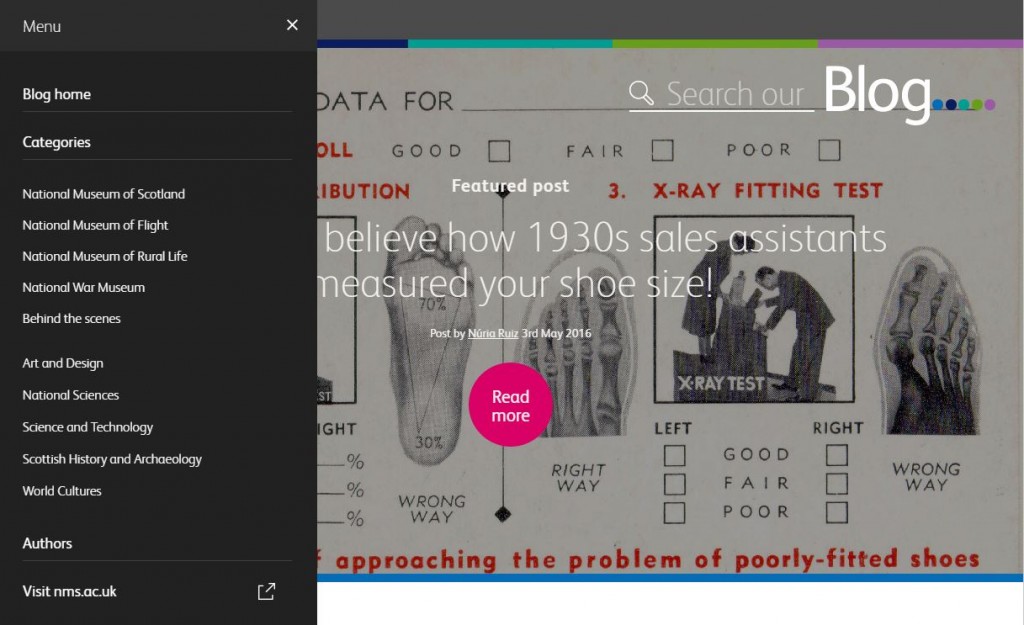
We’ve now opted for a larger drop-down menu to provide users with a simple overview of how the blog is organised and the different ways they can browse – by the ten categories, by author, or by the date-ordered archive list. There’s also a very clear link back to the main website with simplified labelling: “Visit nms.ac.uk” avoids confusion the homepage of the blog with the “home” of the main organisation.
Categorisation and tools
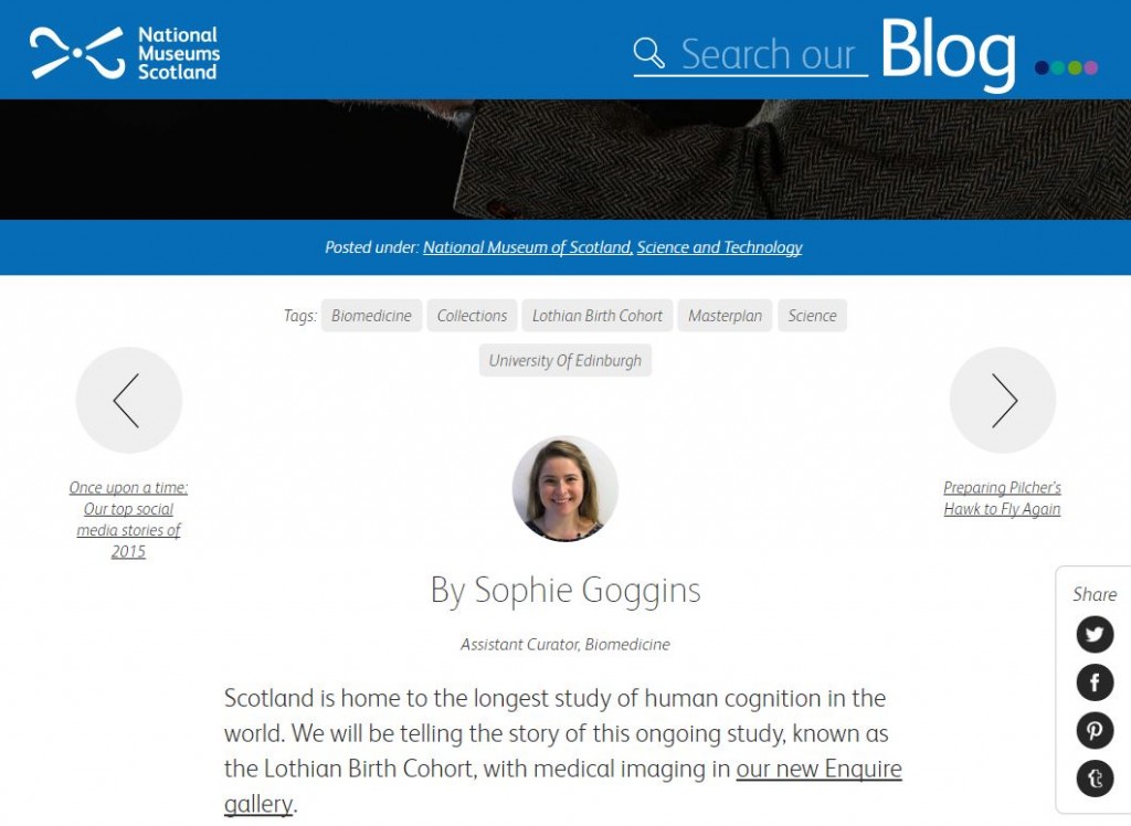
As well as making the main blog categories much more visible to the user in the new mega menu, we’ve added them to a redesigned footer (look down!) and highlighted them in a new coloured bar at the top of blog posts (look up!). We hope it’s now a little clearer that the colour of this bar and the sticky top header echo the colours of the museums from the main website (although this is no longer important for navigating your way around).
There are also some new share tools following you down the page (look right, if you’re on desktop!) They look nice and we’ll monitor to see if they get much uptake.
Homepage
The homepage has been rejigged to echo how people were using the site. There’s now more content on the page and the curated “Most popular” section now appears above the date-ordered list of the “Latest content”. There’s also a “Featured authors” section as a new way to feature content and for users to discover new posts.
Authors list
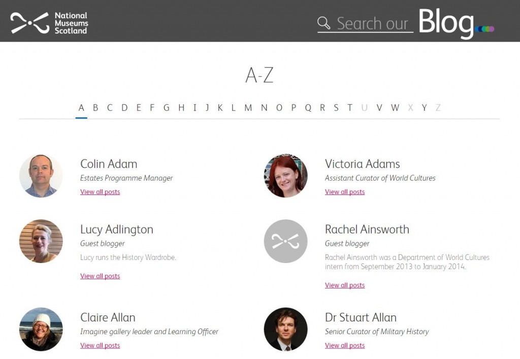
Speaking of authors, there’s now an Authors page listing all the blog contributors in a simple A to Z list. As an aside, we’ve discovered that the out-of-the-box WordPress search looks only at post titles, summaries and page content, but not author names, meaning that searching on a specific surname will often draw a blank. This is something we’re hoping to look into next.
That’s it! Do let us know what you think and if there’s anything else we can improve.
