How do you create an online events page that suits the needs of your organisation and your users?
Edinburgh now seems very quiet after the end of the festivals and a summer that saw the launch of ten new galleries (and a lot of new digital stuff) at the National Museum of Scotland. With a bit of breathing space, the digital team is now turning their attention back to some of the core features on our website.
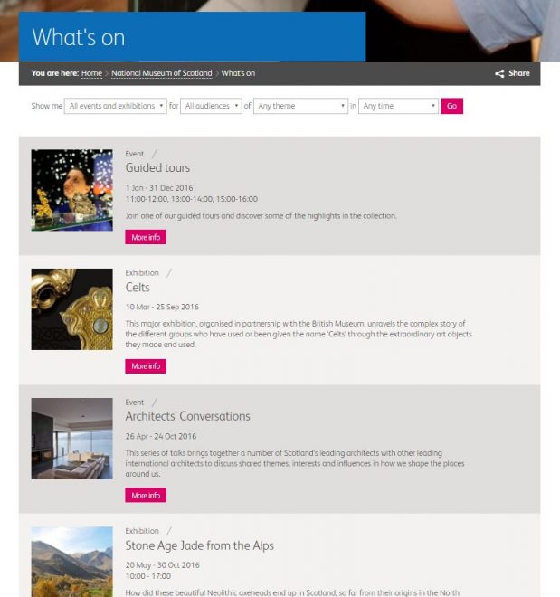
One of these is our online What’s On section, the place where we feature all events and exhibitions happening across our four museums. It’s been a couple of years since we re-launched the main website and, whilst What’s On provides a simple, date-ordered list of events with a range of filters, we know it isn’t providing the best experience for users.
One size fits all?
Having designed a variety of what’s on sections in the past, and looking around at different cultural organisations today, it’s clear that there’s no single model to follow. There are the same basic building blocks for pages (date ordered lists, event classifications, filters) but everyone is doing things a little bit differently. This is most likely due to the different structures, priorities and constraints of organisations:
- Museums, galleries and theatres will always have an event programme unique to them as well as their own ways of packaging them up for their audiences. Take a look at the vastness of the British Museum programme:
LOVE the streamlined @britishmuseum What's On guide – just 1x A3 page w/cross fold! #print #smart pic.twitter.com/eZlzq9NbNG
— Jessie Hunt (@jessiehunt) September 6, 2016
- Organisations inevitably have competing priorities when it comes to their event programmes. ENO for example has a beautiful what’s on section featuring glossy images of the season’s big hitters. In fact, their What’s On page is essentially the same as the homepage. A similar approach may not work for a small museum with a broader range of free events (although the concept of “selling” key messages/events is always important);
- The constraints placed upon information architecture and design by the underlying systems is often a big factor, with front-end options often determined by the flexibility of the events or CRM (customer relations management) system they are built on. Plus, calendars as containers of information are notoriously tricky to work with online, especially when it comes to presenting clear options on mobile.
Also, as Chris Unitt noted in a recent post, there’s no homogeneous visitor behaviour to design around – people with different needs will want to browse and locate events in different ways.
So… it’s not easy and our challenge when rethinking the What’s On pages for National Museums Scotland is to design an experience that both works for the organisation as a whole and serves the particular needs of our existing (and potential) audience.
Getting together
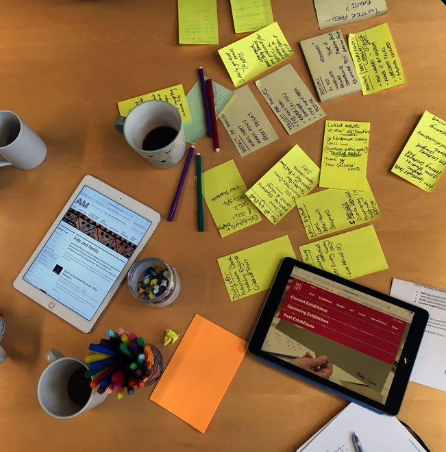
To kick-start the process, I ran a morning workshop with members of the Digital Media team and the Learning and Programmes team (L&P for short). These are the fab people on the front-line of organising and running our amazing events programme.
It’s worth noting here that when the platform relaunched in Summer 2014, we made a clear decision not to have one generic What’s On page featuring events from all our four venues. Instead, each Museum landing page has its own events list. This was based on analytics and user data indicating that visitors either landed directly on or immediately navigated to individual museum sections, i.e. the majority were seeking information about a specific venue and we wanted to present them with only the most relevant information.
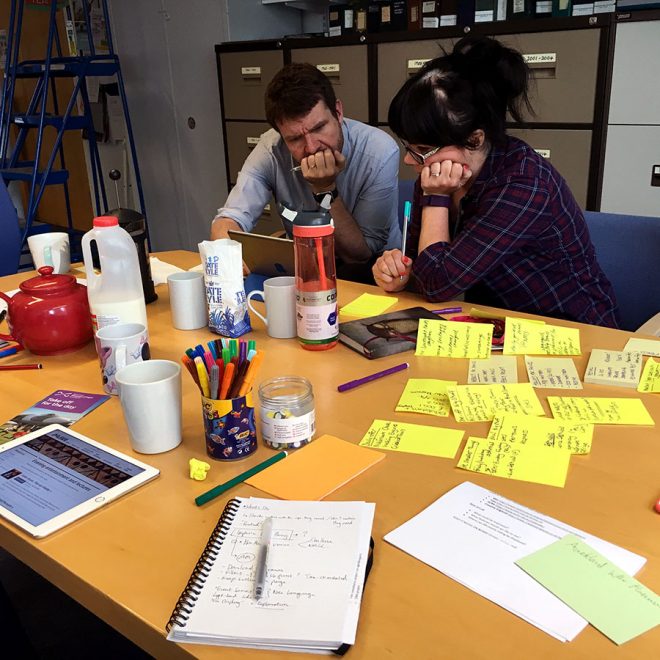
Within the group, the event lists for each Museum were generally seen as functional, well-ordered and easy to understand with the individual event pages praised for their design, and especially their presentation on mobile. However, the limitations of the set-up were quickly spotted, with post-its piling up on the table! The picture below shows the negative comments on the left in red, and the positives in green with pins placed on issues seen as more important:
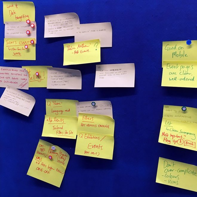
Here are the four key areas where we felt the set-up wasn’t working or could be improved:
- The date filter is currently very limited and doesn’t allow visitors to search on a specific future date;
- The list is ordered by date with long-running exhibitions first and then events listed in date order. There is no real ability to prioritise, promote or “sell” key events;
- The range of “theme” filters are too narrow, do not translate between venues and are often hard for users to understand e.g. is a “Monkey Business event” understandable to a new visitor unaware of this particular exhibition?;
- The lack of dynamic content limits flexible presentation of events. With each event located in a folder-based structure in the content management system that powers the website, event information cannot be fed to and displayed in other areas of the website, e.g. by dynamically listing “Today’s events”, without editorial input.
Understanding our events programme
The next thing we did was spend some time mapping out the full range of event types across our four museums. The What’s On pages as they stand do a very poor job at communicating the breadth of our programme and it was super useful to understand how events vary in terms of length, location, duration and frequency. Our events tend to fall into one of the following categories:
- Large exhibitions running over long time periods
- Smaller display or mini-exhibitions
- Events linked to and grouped around specific exhibitions
- One-off special events
- Regular events (daily tours or weekly children’s events)
- Specific seasons or programmes of themed events (for example, our annual events tied-in with the Edinburgh Science Festival or events linked to the Fringe)
- Educational courses (e.g. MOOCs)
- A couple of other things that don’t fit into the above!
The range of different event types points back to the difficulty of designing a structure which can flexibly accommodate and clearly present such a varied programme. This stuff is hard!
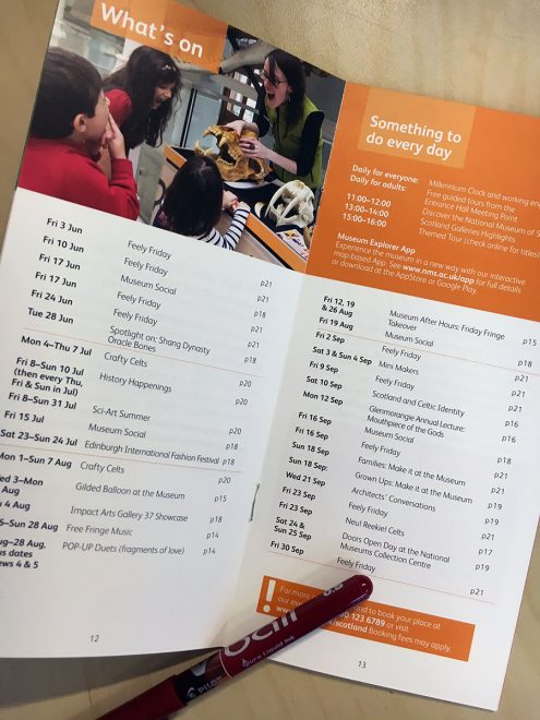
As a quick aside, it was interesting to see the L&P team often pointed to our printed What’s On guide to talk about our range of events. As a “digital” person I often forget that print can provide fantastic examples of condensing key information into a limited space, focussing on the core messages for audiences. The British Museum leaflet above does this extremely well and our own version features some great examples of presenting the right information in the right way.
Quick case studies
For the final part of the workshop we split into pairs to explore examples of what’s on listings from other cultural organisations, mostly those with multiple venues and a similar range of event types. Some general observations, likes and pointers:
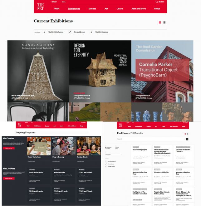
The Met: Things were where we expected to find them and the site does a great job of presenting a huge events programme across all screen sizes. Exhibitions and events are split into different sections, allowing different presentation styles for each. Also presents “Ongoing Programmes” as a separate section for regular event series like tours and talks.
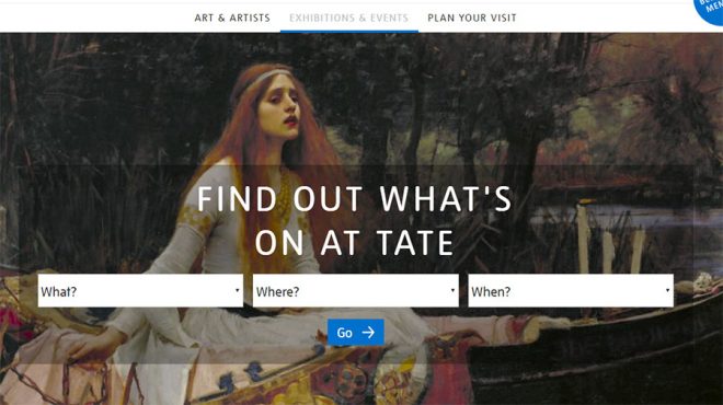
Tate: Uses a filter upfront to force users into immediate choices between Event type, Venue and Date. Results are clearly split up into headed sections by event type (Exhibitions, Performances, Tours).
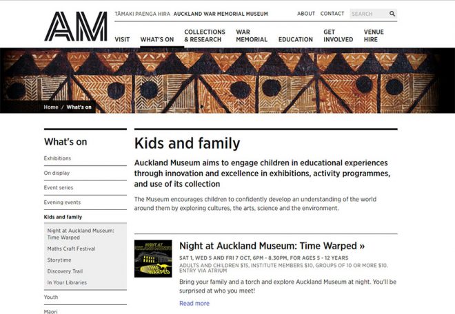
Auckland War Memorial Museum: Very clear use of filters at the top of the page with user-friendly language (we felt we always knew what we were clicking on). The L&P team also liked the introductions to different category pages (e.g. “Kids and Family”) providing an overview of each strand of the overall events programme.
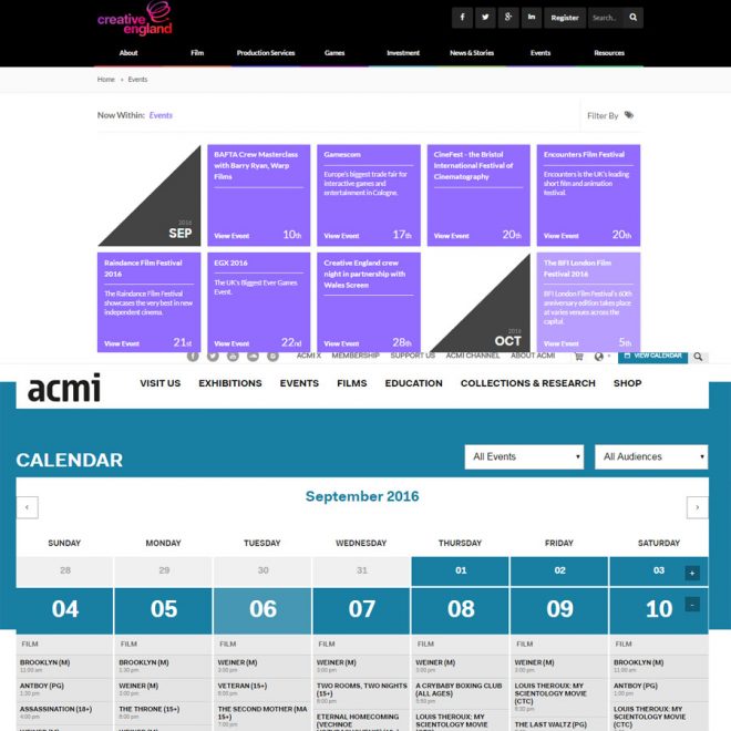
Creative England and ACMI: Demonstrate two very visual approaches to event organisation in a more traditional calendar view. These approaches have the advantage of quick scanning by date versus limited information and some slightly tricky display on smaller screens.
Other notable examples included ENO which has been mentioned above for its beautiful use of images and clean design. We also looked at the British Museum and liked the simplicity of the dynamic “Today’s events” list and the longer date-ordered list.
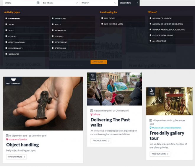
**spotted after this post went live** The Museum of London pages have a great drop-down menu of really clear filters using sensible language and their listing has a great set of icons for each event “type” (although I expected these to be clickable and act like tags):
What’s next for What’s On?
This post began with the question: how do you create an online events page that suits the needs of your organisation and your users? So, the next step will be to talk to our users and explore their behaviour on our site. What are they looking for when they visit nms.ac.uk? What are their expectations and motivations? What do they want and need from What’s On?
To help, let us know what you think about the current set-up in the comments below and point us to any What’s On sections representing good practice and user-centred design.
