

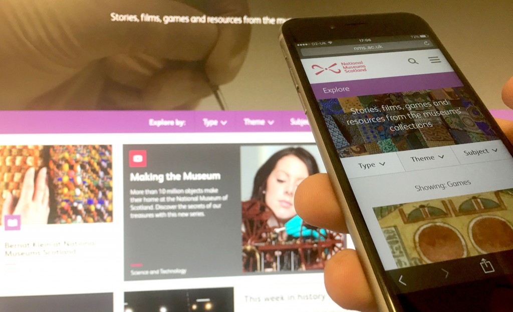
This week we unveiled a full revamp of the Explore section on the National Museums Scotland website.
When we relaunched the entire website in 2014, we overhauled almost every aspect of it. This included the introduction of a new content management system, a complete visual refresh, reworked information architecture, and a suite of new content. At that time we put a lot of emphasis on people who are using the website in conjunction with a visit to one of our museums. And rightly so – in common with the vast majority of museums and visitor attractions, a high proportion of our online traffic is inextricably connected with coming to a ‘physical museum’ in person.
But what of those who aren’t planning a visit? One of the key objectives of the website, and indeed the Digital Media team, is about bringing the museum to life online and using digital channels to help deliver the organisation’s mission.
Over the years the site has amassed an eclectic selection of learning resources, games and stories about objects in the museums’ collection. Some of this has been the result of specific projects, some has been part of a more concerted effort to increase the amount of material online, some is the legacy of long-gone exhibitions. This has left us with a diverse array of ‘stuff’ which while interesting, fun, and popular with website visitors, has always lacked a bit of coherence as a whole. Grouping all this material under one heading – Explore – was an important starting point, but we knew that we had work to do to deliver a truly useful, engaging resource and fulfil our ambition to create a genuine “online hub for our collections activity”.
Starting with the audience
We’ve long been involved with Culture 24’s action research project Let’s Get Real and as part of their ‘Is your content fit for purpose?’ strand in 2015 we undertook an in-depth examination of Explore that combined Google Analytics data and audience surveys. This provided us with a detailed view of how people were using the section, what they wanted and didn’t want from it, popular topics and themes, as well as some real texture on the content they loved (and some very specific gripes).
Combining data from our internal segmentation model, we came up with a set of key findings and a prioritised list of changes and improvements to inform our redevelopment. Broadly these fell into the following areas:
- Improve the findability/browsability of content;
- Improve signposting in general: a lot of people weren’t finding content and features that we assumed were easy to locate;
- Improve the content itself: more + bigger images, more multimedia, better layout and features, more in-depth information.
Casting the net wide
As well as responding to what our audiences and data were telling us, we also wanted to ensure we had a website that fitted with people’s contemporary browsing expectations and paid heed to current trends.
We undertook extensive research of sites and cherry picked features that we liked from a variety of sources. We ended up citing a number of different influences in our brief, including some of the following:
- The intuitive categorisation of the BBC iPlayer;
- Martin Belam’s ancient but still highly relevant ‘Tags are Magic!’ series in The Guardian, and the impressive tagging on the Awwwards site;
- Simple user cues such as “time to read” found on sites like Medium and the unmissable Storythings newsletter;
- A focus on long-form content, which many sites have experimented with, but particularly Wellcome Collection’s excellent immersive Collections Stories. We kept a log of sites we drew inspiration from on tumblr.
Working closely with Lewis, our digital agency, we defined and refined the design features and functionality that would go to make up what you see now in the new ‘Explore’.
A means, not an end
The result is something we hope is a vast improvement to what was in place before. Some of the features we’ve implemented include:
- A deceptively simple curated homepage that showcases content from across our collection;
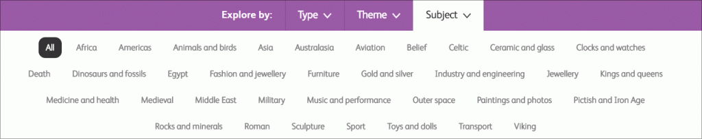
- The introduction of simple filters – type of content, themes, and subjects – to access material in a number of different ways;
- Human-friendly tags. Museum terminology can be confusing and highly specific, so we’ve adopted a simple set of terms under which to group stories;
- New long-form templates that allow us to experiment with layout, divide content into chapters, and embed an array of different media;
- Decoupling our online collections search from the rest of the content on Explore – user research clearly pointed to distinct audiences for each of these areas. So while there are still tangible links between the two, they sit separately within the site’s overall information architecture. And as part of the project we also took the opportunity to improve the design and functionality of Search our Collections;
- An experience that displays elegantly on a smartphone, but scales to give greater impact on larger screens.
But as with many digital developments, what we’ve launched with is only a step along the way. Having put in the hours to migrate and reclassify content, our focus moves onto new stories and features we’re planning, and how to make best use of the tools at our disposal. Our intention is to cultivate a platform for storytelling rather than simply ‘another online place to put things’. We’ll be rolling out fresh content over the next few months, and tweaking and refining elements as we go. We’ll also be undertaking follow-up evaluation when we’ve got a sufficient amount of user data.
To help us, we’d love to hear your opinions on the changes we’ve made and the thinking behind them.