This post isn’t about QR Codes. Despite the fact that QR Codes (short for Quick Response Codes) will be mentioned several times and possibly be the reason you’ve arrived here in the first place, I wanted to draw a line in the sand straight away. What it is about is using technology in a flexible way, the increasing importance of mobile phones as part of the digital museum, and – as ever – good content needing to be at the heart of meaningful online experiences. Apologies in advance if it’s a little geeky…
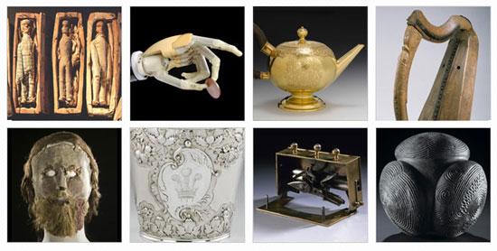
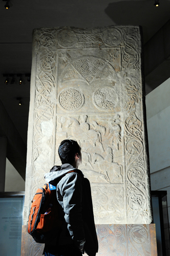
Before I get carried away in tech talk I’ll first explain what we’ve put in place. A project called 26 Treasures has just been unveiled at the National Museum of Scotland. 26 writers were each assigned an object from the museum collection and asked to write a response to it, and each of these responses is now on display within our Scotland galleries.
As part of our interpretation we decided to edge the boat out a little further – as the aim of 26 Treasures was to give objects a voice, we felt that voice should be heard. We recorded each writer reciting their piece, and by using their own smartphones visitors can now access and listen to each of these audio recordings.
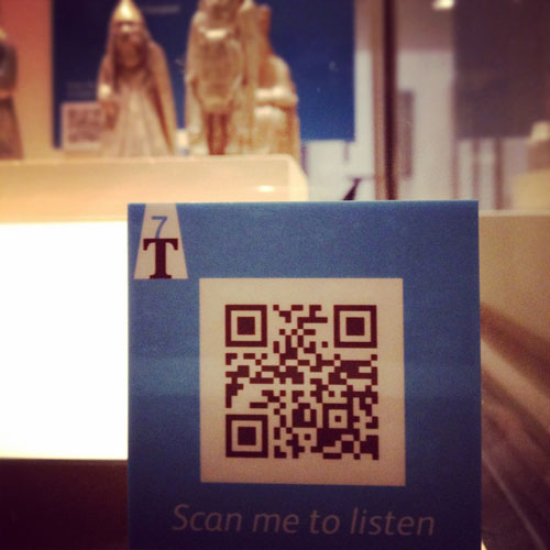
Our aim was not only to deliver something that adds value to the overall exhibit but also be an example of best practice, using information we’ve garnered from previous projects and advice we were able to pick up online, and from other museum and galleries. We’ll be keeping a close eye on our stats to get a sense of how popular uptake is.
What follows are a few points that I think are worth bearing in mind for organisations looking at how they make use of mobile.
It’s about the content and context, not the code
From my many years of experience in this field, I can’t recall another aspect of digital media so badly implemented and inconsistently applied as QR codes. Their unstoppable rise in 2011 has seen a swarm of brands and organisations jump on board a bandwagon they seemingly have little understanding of. So we see codes that simply don’t work, codes that point to websites that haven’t been optimised for mobile phones, codes with calls to action that can’t be fulfilled, codes used as Twitter avatars. That’s without even getting into whether or not normal human beings actually use them (or even understand what they are).
Our aim, therefore, has first and foremost been about creating content that we feel enhances the physical museum visit, and the primary effort has been around creating a consistent, quality audio experience. The QR code is merely the trigger, what follows allows people to listen to that audio on as wide an array of mobile devices as possible.

Use flexible, available technology
The wonderful thing about the web today is that you can often rely on it to provide a toolset that would have been difficult to imagine just three or four years ago.
For this project we used audioboo to host the MP3 audio files and an open source javascript library called audiojs to generate the player. audiojs uses the HTML5 audio tag, if your mobile web browser supports it, and otherwise falls back to an invisible Flash player. This allowed us to get fairly comprehensive device and browser coverage without having to reinvent the wheel.
The pages we point the QR codes to are part of our mobile-optimised site, but an alternative to this would’ve been to host the audio on a WordPress blog where most themes automatically detect mobile phones. We’ve used bitly to generate the codes themselves, which also allows us to neatly bundle the links for tracking purposes.
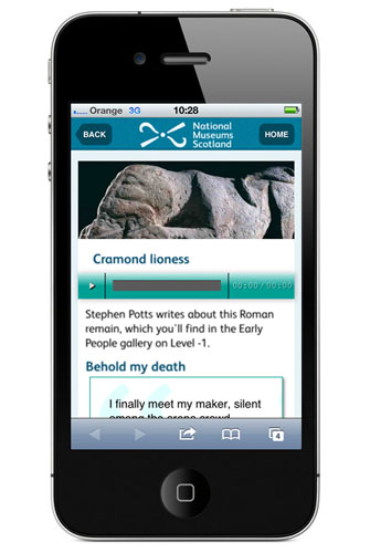
In the past, delivering a multimedia experience like this would have almost certainly needed to be outsourced, but these days the right balance of in-house skills and awareness can reduce costs dramatically.
Getting more mobile
Use of mobile devices – whether smartphones or tablet computers – to access the web is on the rise dramatically, and this poses a new and tricky set of questions for all organisations who produce and deliver content. How do we cater for the mobile web when so much that’s gone before has been focused on static, fixed PCs? How can we make sure the experiences we create stay relevant to the devices people access our content on? Is the browsing experience fundamentally different on a mobile device to that of a PC?
Much is likely to change over the coming years, so it’s important that cultural institutions are experimenting and iterating with mobile however and wherever they can to help them understand how visitors respond and where value can be derived.
26 Treasures is the first project where we’ve driven traffic directly to our mobile website. The nature of the project – short bursts of narrative – is the perfect subject matter as this provides an experience where people are encouraged to snack, rather than stay absorbed for hours. The small file sizes also get over some of our connectivity issues, so the content should be relatively accessible on even a flaky 3G signal.
Integration everywhere
As well as integrating various bits and pieces of technology, we’ve also tried to think beyond gadgets alone and ensured that there’s as much information as possible to allow people to better understand what we’re doing. The map-based trail available at the gallery entrance contains an overview of QR Codes; each of the codes themselves prompts visitors to “Scan me to listen”, and we’ve published information about the use of codes on our website and via our social media channels.
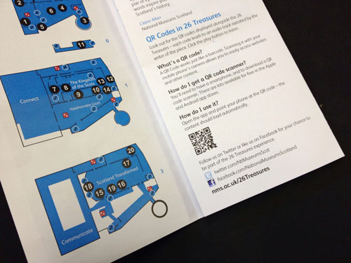
Given that people seem to be generally confused about QR Codes, it’s been important to provide as much light touch supplementary information as we can.
You can’t be perfect across the board
As mentioned, we’ve had to consider connectivity issues and there are points within our building where a strong mobile signal isn’t available across all networks.
The pay-off for using the HTML5 audio player is that earlier versions of Android aren’t able to play the audio, but that’s more than worth compromising to be able to include iPhone users, who still dominate the number of mobile visits to our website.
In my experience with delivering any kind of web project is that you have to be pragmatic and accept, whilst striving to make everything as accessible and usable across the board, it’s not always feasible to please everybody.
In summary, hopefully what we’ve done is create an experience that can be enjoyed by as many people as possible, and we’ve delivered, on a tiny budget, something that’s successful and that others can learn from.
