Find out how and why we created a contactless donation experience at National Museums Scotland.
The Digital Media team at National Museums Scotland has been thinking about visitor donations for quite a while. Way back in 2015 we walked past the Cancer Research shop on Kensington High Street featuring their “Tap to Donate” campaign. A screen displayed a scientist at work and you could donate from outside the shop with simple tap of your card on a contactless terminal (watch a video intro here). It seemed like a really innovative use of tech allowing you to do something in the simplest way possible, even when the shop itself was closed.
This is perhaps why I’m drawn to Contactless payments. Not being a very patient person I like things that speed up the mundane processes of modern life, whether paying for my lunch or progressing on my journey.
Growth and adoption
Over the last few years, Contactless has seen huge growth in everyday usage and is becoming accepted as a way to conduct small everyday transactions (I’m now surprised when shops don’t have a contactless option and suddenly chip and pin seems a bit cumbersome).
With the average contactless transaction around £9.00, two in ten card payments in the UK are now made via contactless and the last year has seen a 21% rise in the number of contactless cards in circulation (both debit and credit cards) and a 165% increase in total spend. There are more detailed stats if you like that kind of thing at the UK Card Association. Interestingly, the pattern is very different in the US with a much lower proportion of debit cards in circulation to start with, although mobile payments using Apple Pay have seen higher comparative growth rates.
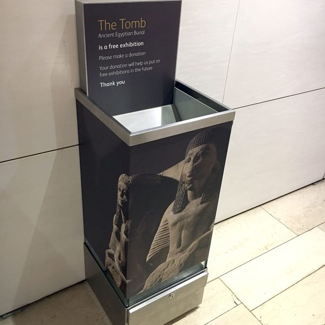
Contactless for Charities
In theory, contactless payments make perfect sense for facilitating the types of low value, high-frequency transactions traditionally sought via donation buckets or boxes. People are also carrying a lot less loose change which is often the excuse used to avoid donation buckets on the street! Having said this, I think tourists still prefer to pay for things in cash to avoid card transaction charges.
Despite the ease of contactless payments, the act of donating is a different type of transaction compared to the retail environment. Here the payment process is an integral part of the transaction where you receive a direct benefit as a result (receiving a coffee or accessing a station platform for example). In contrast, with donations there’s much more emphasis on the giver to voluntarily take action. There are numerous examples of charities, and some cultural organisations, trialing contactless giving (see the growing list below) but I’m not sure the tech has yet become accepted or ‘normalised’ in these environments.
The novelty factor of finding a different way to donate is always a great incentive, but I think there’s still an important difference between the physicality of dropping coins into a donation box compared to just an instant tap and beep. It can seem strange that something so friction-less can facilitate a transaction which can be both meaningful and emotional for the giver.
However, as our Head of Development, Margaret Clift McNulty pointed out at the start of our project, museums could offer the perfect environment for contactless technology and our aim was to create a donation mechanism integrated into the visitor experience which is already very visual and interactive.
Who is using Contactless donations?
A range of organisations have experimented with some form of contactless donations over the last year or so. Here are just a few examples that caught my eye. If you know of any other uses of contactless payments, especially in cultural organisations, let me know and I can add to this list.
- The Blue Cross attached digital donation boxes to dogs
- Cancer Research’s new smart benches combine Wi-Fi hotspots, mobile charging and contactless donation points
- The Barbican installed a single Payter terminal outside their Curve Gallery back in Autumn 2016.
- The National Gallery‘s Mosaic Masterpiece project allows visitors to select between three donation amounts (£5, £10 and £20) before taking an image of themselves to be included on large screen display of a masterpiece. Donations are made via a WorldPay terminal (see image above).
- Teenage Cancer Trust have been trialing stand-alone contactless boxes and this post by Dan Papworth-Smyth from a year ago has a good summary of other charities doing the same
- The Church of England have jumped on board by recently announcing digital collection plates!
- Just this week, the Horniman Museum have launched a simple Payter terminal asking for a £1 donation to support the re-display of their World Gallery
Donating to the redisplay of our new World Gallery is now even easier than before.https://t.co/5RNX97JIGf pic.twitter.com/jvm8ZesFId
— Horniman Museum (@HornimanMuseum) July 21, 2017
Creating a contactless experience
Our own explorations of contactless giving started off with a workshop at digital agency Earnest. Their “innovation lab” had previously worked with Mary’s Meals to enable lunch-goers to make a small (30p) donation to the charity via transportable “Lunchbox” contactless terminals. This gave us lots of ideas about the types of experience we could create for different spaces and audiences — from visitors choosing their favourite museum object by tapping to vote to more traditional fundraising totalisers supporting a public appeal. We were also given some great pointers on the tech set-up used by Mary’s Meals and started investigating how to get set up with the terminal provider, Payter.
A big shout out here to James Hairsnape , formerly of the Barbican Centre, for taking the time to meet us and providing invaluable background information about the somewhat arduous set-up process. The Barbican were literally ahead of the curve (groan) and managed to launch a single Payter terminal outside their free Curve Gallery back in Autumn 2016.
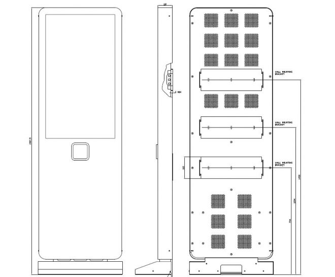
Designing the user experience
We had a small budget (>£5k) to work with an agency to design an attractive and simple user experience around the core action of tapping to donate. The project tender was won by a brilliant agency called Wiedemann Lampe and we quickly came up with some guiding principles for the project:
Attract attention — We instinctively felt that a stand-alone box wouldn’t be enough to attract people over or convey an emotive enough ask. Something other than the box itself had to draw visitors in.
Be as friction-less as possible — We wanted to make donating as easy as dropping a coin in a bucket and keep the “one-tap-and-your-done” philosophy that makes contactless so great to begin with. This meant discarding any thoughts of capturing visitor data or asking for user generated content etc.
Create a natural ask — Placing the terminal outside a forthcoming exhibition on Ancient Egypt immediately made sense as it was predicted to be popular and had free entry, providing a natural moment in the visitor experience to ask for donations. This also meant designing something for an adult visitors in the first instance as this was the target audience for the exhibition.
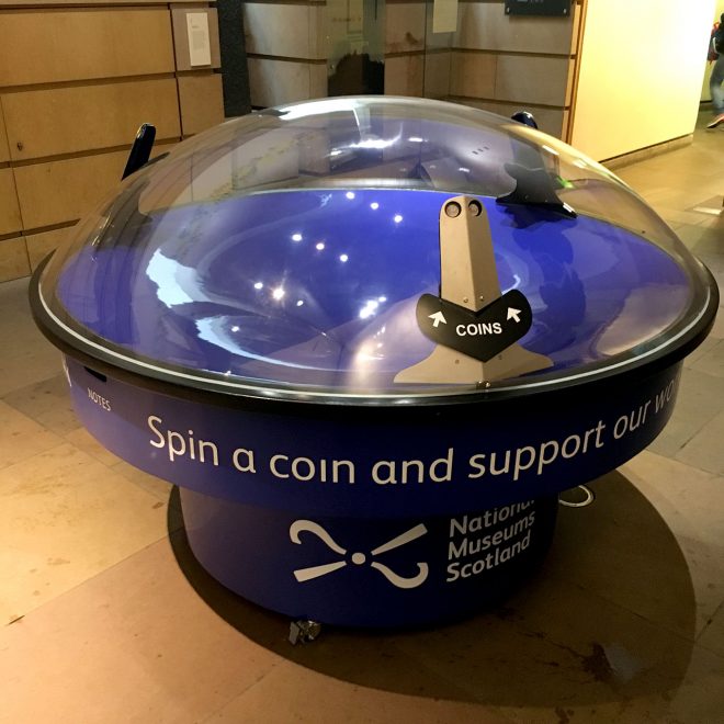
Provide an experience—Rather than an isolated tap and beep, we felt that the museum space offered the opportunity to integrate the act of giving into the visitor experience, providing something both visual and interactive. Our aim was to create the digital equivalent of a simple coin spinner, where your donation is rewarded with a short but satisfying experience — and one that you (or your child) will want to repeat.
What we created
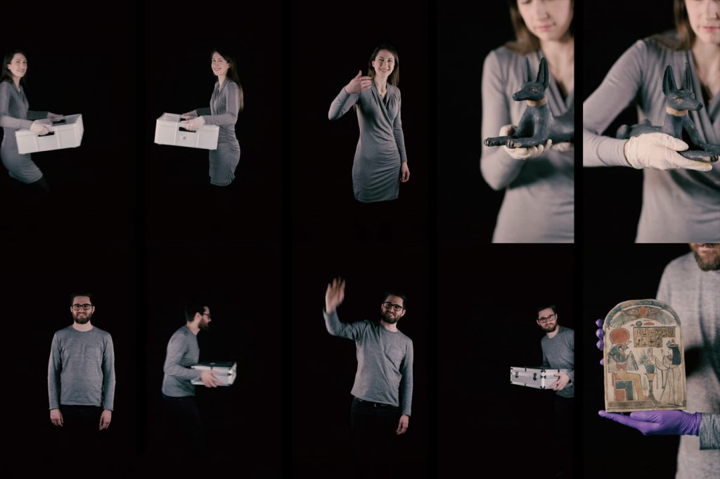
The final experience shows a video of the lead curator of The Tomb exhibition, Dr Margaret Maitland, and then her colleague, Assistant Curator Dr Daniel Potter, on a portrait-oriented 42” screen. They stand looking out at visitors, making eye contact, carrying objects across the frame and waving or beckoning to attract people over to the kiosk. We shot this very simply against a black backdrop, in portrait mode and in 4K so we could crop into the frame (thanks Edinburgh Film Company). It’s pretty hard to get people to simply stand or walk naturally but both Dan and Margaret were really great at trying things out and taking instructions like “be more normal!”.
Donations have been set at £3 initially and there’s some short call-out text overlaid on the video screens, as well as some Egyptian-themed graphics and a big blue call-to-action button making it as clear as possible what to do. On tapping your card or phone on the terminal a thank you message appears, before your chosen curator reveals their favourite object from the exhibition in close-up detail.

Because card payments are processed so quickly and signalled with just a single “beep”, we ended up adding some friction back into the process. A rotating “processing payment” stage was added into the flow making it seem like something more definite was going on behind the scenes. There’s also a totaliser screen that can tot up total donations made against a set target, although we decided to exclude this from this initial test as we were asking for general contributions rather than running a fundraising campaign.
Through the development process we were also working with BlackCat Displays to help us design and build the totem-style kiosk. This had to house the large 42” screen, the Payter terminal and a mini-PC running the software. It was a nice change build something to sit in the physical space and take delivery of a large three-dimensional object on the back of a lorry!
The tech set-up
To run the system behind-the-scenes Wiedemann Lampe built us a really neat little self-contained content management system (CMS). Sitting on a mini PC housed in the kiosk the system talks to the Payter terminal and changes the video display on the point of recognising an approved donation.
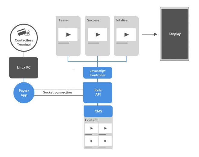
In essence, this means that we have a very flexible system that we can change and re-purpose with minimal effort and, importantly, at minimal cost. For example, any of the text displayed can be edited on the CMS, the totaliser amount can be changed and the video files can be swapped out for a completely new look and feel. By accessing the Ubuntu desktop on the PC we can also download software updates via GitHub, stop and re-start the application and change the fixed donation amount on the Payter terminal. Purchasing a simple wireless keyboard has allowed us to access the mini-PC within the housing without having to remove covers or shut everything down — a small thing but it’s proved invaluable to make quick changes.
Results and learning
It’s still early days in our trial but after being live for about 4 weeks we’ve had some really great feedback on the kiosk. Donations are ticking over at between 1–8 per day, which is probably equivalent to the coin-drop donation box also positioned at the end of The Tomb exhibition. I also don’t think the contactless terminal is competing too much with the coin donation box but is instead attracting additional donations.
Here are some of the things we’ve learned through the whole process and after being live for a month:
Getting set up takes time — Build in lots of time to get set up in terms of the tech and the financial side. A merchant account often needs direct correspondence and approval from a Director or a Trustee. Talking to Payter was very helpful and we ended up signing an agreement directly with them, partly to get early access to their SDK.
Working horizontally is hard — This project involved lots of different teams across the organisation, including Exhibitions, Commercial, Visitor Experience, Development, and Technical Services. As a Digital team we’re used to pulling together project groups like this but it’s often hard in organisations with vertical structures and a tendency towards silo working.
Positioning is really important — We originally designed the experience to greet visitors on entrance to the free exhibition. However, a lack of accessible power source and having to tether the kiosk to a wall (rather than drill into the Museum’s limestone floors — a big no-no!) meant that we had to re-position outside the exhibition exit. From observing visitors it seems as though they have both physically and mentally checked-out of the exhibition as soon as they exit the space. Capturing their attention before entering or integrating the experience into the exhibition itself might have helped gain more attention and make the ask seem more natural.
Visitors still like contact — This comes back to both users’ expectations of where and when they encounter contactless payments and the type of transactions it is used for. Voluntarily donating via a simple tap is different to paying for a product or service. I think you need to either provide a really simple alternative to traditional donation boxes (tap here OR insert money here). The alternative to replicating simplicity is to create an enticing experience to reward people in some impactful way for their donation (back to the equivalent of a coin spiraling around the coin spinner. And another coin. And another).
Flexibility is key — The ability to test things out and change things at minimal costs will be key to getting contactless donations right at National Museums Scotland. The current version is our first attempt and we want to create new experiences in new positions around the Museum, learning as we go.
Next steps…
We’re hoping to experiment a little with different donation amounts and have already changed some of the key messaging on the attractor screen. As mentioned above there’s a general feeling we’re currently missing an opportunity to engage with people in the right frame of mind, make the ask more integrated into the visitor experience or simply place the kiosk in an area with much higher footfall.
With Wiedemann Lampe we’re now thinking about ways to share the set-up with other cultural organisations wanting to create similar contactless payment experiences. Do get in touch if you want to find out more. There’s more detailed information on the project on a Medium post right here.
A big thank you to my colleagues who all helped make this project possible, including, among others, Hazel from the Digital Team (@Hazler_06), Tom from Technical Services, Margaret (@CollectioveMarg) and Michael from Development, and our former colleague Hugh Wallace (@tumshie).
